Monday, September 10, 2007

COLUMN 9AA - WARPED BY THE LEFT WING

COLUMN 9AA - WARPED BY THE LEFT WING
Adam Larson / Caustic Logic
The Frustrating Fraud
September 10 2007
last updated 9/11 early am


In assessing the outer column damage upon impact, I had been hazy for a while on the status of column 9aa (aa meaning the outermost position on a column line). It would have been two columns over to the left (north) of the collapsed portion, and officially impacted by Flight 77’s left wing but left intact. In error I had included it as part of the columns-removed area, which I had taken as too wide. This has now been updated. Although I was focused on the right-hand side and didn’t see or wonder about this non-controversial support. It was usually listed as intact though deformed and impaired, and no-planers hadn't made any noises about it I've heard. But finally I have looked into it and found a few early (pre-shoring) photos that show it – barely. Column line 9 is roughly highlighted in each of the below to help locate it


By coincidence, these four shots rotate, zoom out, and clear-up if looked at in sequence. The first, least clear shot is pre-collapse, less than 20 min after impact, seen close and from the left and obscured by smoke. The second view is further out, just after the collapse, and somewhat clearer. The third view is off to the right from behind the smashed generator, with all up-front fire extinguished, and the final view is a long shot from the far right. Note how the curvature of the columns seems to shift with perspective – it bends to the left when seen from the left, appears straight seen straight-on, and curves to the right when seen from that side. This shape consistently indicates in inward bend.


Column 9 is also visible in figure 9 from FEMA’s Shoring Report (above), again seen from the right, post-collapse, post-fire, but pre-shoring. It’s the “damaged column,” one of the many that necessitated the bracing that report documented. Other photos of column 9 in the report, once the wood went up, are taken head-on and show no evident lateral curve. Figure 16 (left) shows the first of the supports being finished the night after the attack, with the space to the right still left hanging.

The close-up photo used in the American Society of Civil Engineers’s 2002 Pentagon Building Performance Report shows a column displaying “triple curvature” (shown from the right). Besides three remnants of its original square-sided casing, the angular concrete is gone, the column “stripped to spiral reinforcements.”

Regarding the evident curve, its clear inward orientation is seen elsewhere in the building with other columns, in what appears to be a bowing by Boeing. The fulcrum of appears to be in its upper portion, about 2/3 of the way up from the foundation. This is presumably the impact point of any type of wing in the area. The ASCE’s report listed the column as “5 to 6 inches out of plumb.” By the photo below, showing the column and its bend in its stabilization period environs, it seems visibly at least that misaligned at the top end in particular, further indicating a high impact.

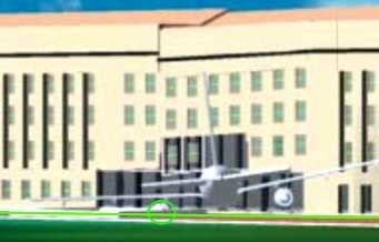
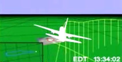
But this graphic used in the ASCE’s report seems to disagree, with the left engine centered just to right of column 11aa with columns 10, 9, and 8aa visible to left. In addition to there being no evidence of the left engine entering well below ground level as shown, the wing crosses low on column 9 in this mock-up, almost certainly too low to have created the bend seen above. It might seem presumptuous of me to question the ASCE's graphic placement, but it seems warranted by this evidence to venture that we have an inaccurate graphic here.

They seem to have placed the right wing correctly given the building damage at that location, but neither the left wing or engine seem marked properly. Perhaps they were trying to avoid an overly-complex explanation as to how the wings could impact at differing angles from each other, and just dropped on an intact 757's profile stretched to account for the angular impact. This is about the same reason I've done the same and am still not explicitly reconciling the wing discrepancy here. But the key to seeing how this is possible is to keep in mind that the plane impacted at such an angle that the right wing/engine and much of the fuselage were scattered inside the building by the time the left wing or tailfin ever touched the facade or outer columns. I intend to post this theory in the near future, but for now, I propose a correction like this:

My green rotation, compared to the ASCE's in red, accounts better for both the column warping seen here and for the lack of an engine burrowed six feet under the floor slab. It does seem the engine was likely low enough to have impacted the building’s foundation, if glancingly, and also possibly just high enough to have cleared the floor. This ambiguity is interesting for another study of Citizens’ Investigative Team's undamaged foundation claims by possibly making their point moot.

Sunday, September 9, 2007

CITGO VIDEO ANALYSIS

CITGO VIDEO ANALYSIS
(working version posted June 28 2007)
Adam Larson / Caustic Logic
The Frustrating Fraud
Last Updated September 9 late pm


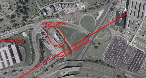
The Nexcom/Citgo gas station was the last real building near 77's flightpath before the Pentagon. Its security video was confiscated by the FBI on September 11 2001 (apparently NOT within minutes of the attack but rather a few hours later). It was held for five years and then released pursuant to FOIA requests on September 15 2006 to Judicial Watch.

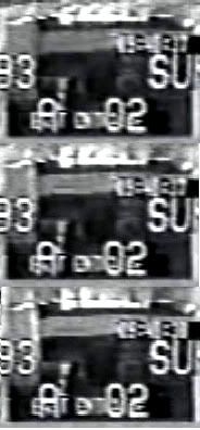
The station had multiple cameras multiplexed together onto one screen. Some of the best views were NOT included in this compressed multi-camera screen. Whether this constitutes manipulation/forgery or some more inoccuous explanation I can't say for sure. But it is suspicious, and some of the cameras themselves seem to have been removed since then.


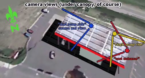
Youtube link: http://www.youtube.com/watch?v=2LJvFjsl6zk&mode=related&search= An analysis of what the remaining low-resolution screens show is in the works. Previously I'd said it showed "more nothing than anything yet," but in fact there are good clues in there. Of special interest are three camera views, mapped out on the model below.

Dual-Pump Camera and the Canopy Flash
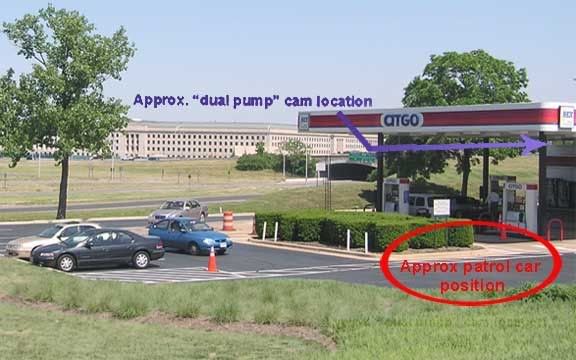
Just looking at the view from the "dual pump side" camera (the north end of the station) we see a flash at 4:44 in the video, or 9:40:38 by the video's internal clock (app. set about 3 minutes ahead). The white car there most of the time at the pump is Sgt. Lagasse's. The sequence here: a black and white patrol car pulls in and sends the flash of light, reflected from somewhere else apparently to the south, onto the underside of the canopy, at which point the patrol car speeds away, possibly towards the Pentagon
My video - part 1 of the Citgo analysis, just the canopy flash.

Youtube link: http://www.youtube.com/watch?v=3ChV5gxYfrc#GU5U2spHI_4

Here is a photo of the station's north end - parking, hedges, canopy and pumps - with the Pentagon visible in the background. Compare to the camera view above.
Before getting to angles, I must note that some north-path proponents contend this flash is either from the plane but glancing off the car's roof, or simple sunlight reflected in a flash as the patrol car started rolling (see comments at the Youtube link for my video). It does seem to start inching forward just just a hair early - too subtly it seems to account for a sudden flash, but enough to make this interpretation seem feasible. The angle the light is coming from seems about the same as the angle of natural sunlight at that time, but a different part of the car also catches sunlight a few frames later in a different position. (I intend a fuller anlysis on the timeline of all these events). John Farmer's rebuttal and my counter-rebuttal: link.

However, as I will expand on in this space and with further short videos, there was also a noticable flash of light on the south side of the station a split-second earlier, clearly not reflected from the south side of a car on the north side of the station. There's also employee/customer reactions indicating something happening to the south, and a large shadow also visible on a roadway south of the Pentagon. These will be explained and even if the canopy flash is just sunlight, it somehow seems to show the same thing the other clues do: something other than the sun was sending light to /blocking light from the Citgo, from the south and southeast just before people started gawking towards the Pentagon. A high-speed, low-flying silver AA 757 is one possible culprit for at least one of these clues...

East Entrance (south) View and the Double Flash
This "East Entrance" camera is at the southern edge of the southeast canopy looking back at the store to monitor customers coming and going. Note at left the lightening on the left-hand side, on the narrow east-facing edge of a wall there. This "flash" seen at 9:40:37 is longer in duration than the one off the patrol car half-a-second later, and perhaps better described as a "double-pulse." In slow-motion (video coming) there is an intial pulse just before the canopy flash, which washes in top-to-bottom and fades just as another pulse of light blankets the spot and then fades. Duration: unsure at the moment but seems to be about one second. The light source is roughlly to the east, and could be from either a plane heading from the north or the south.


Below is the video of this flash. Sorry for the glitch - it hangs up just before "slow-motion." Maybe I'll re-post it.


The Shadow
Thanks to John Farmer's interesting work, I can see the shadow now. It's visible in the south-side "Single Pump" camera, and cast on the roadway behind the station (South Joyce Street), divided in two by some invisible obstruction (possibly a median/divider). It appears at 9:40:35 (about 2 seconds before the flashes) by the video's clock and remains for about 8 frames, 1/4 of a second (though it appears stationary, apparently a still frame taken at 4 fps). All-in;all it's a large shadow. A 757 is one possibility.

I know this is crap quality to be blowing it up so big, but hey,
it's there. It can be (roughly) measured.
Youtube link: http://www.youtube.com/watch?v=hF-GcL8hR68

General Thoughts
Quotes from north path/no plane supporters: would these researchers talk about this key evidence like this if they thought it supported their theory or was irrelevant? (most from the inital Loose Change thread spurred by Russell Pickering's analysis)
John Doe X: "Talk about chasing shadows...lol." link
Aldo Marquis/Merc: "I believe the Citgo video was released SPECIFICALLY because of the Citgo witness and his account. I no longer believe this as a possibility, but as an unforunate reality. A counter chess move if you will. [...] This is a clever trick in response to the Citgo employee's account. Simply more bad video with a few editing/graphic/lighting tricks, just like the others." link
Undertow: "You know, I started to analyze that flash 4:44 (mov time) but it's just worthless in all its pixelated compressed crappyness. I don't know what anyone can possible get out of this video besides a migrane." link
(John Farmer's quote removed - I'm not so sure now he belongs on this list)
Craig Ranke (Lyte Trip): "No serious 9/11 researcher would take this video at face value. It makes zero sense." link
Craig Ranke to me: "Evidence tampering is a Federal offense and if you insist on supporting this dubious data that is supplied from the very individuals that you accuse of this crime you are just as guilty as they are." link

So naysayers aside, and all concerns of legitimacy vs. fakery taken into account (the grain of salt one must take this with), the analysis continues.

Thursday, September 6, 2007

CSV FINAL PLOTS

CSV FINAL PLOTS AND FINDINGS
Adam Larson / Caustic Logic
The Frustrating Fraud
September 7 2007

Again with the things that've been done before.

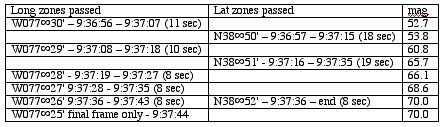
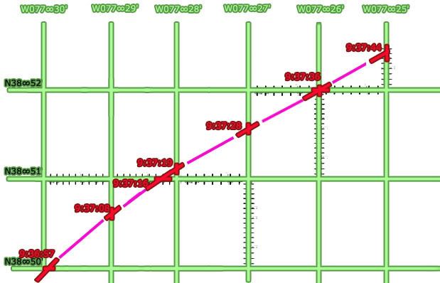
In trying to map out the final locations of the plane recorded in the csv file, I ran up against the problem of readings measured with degrees and minutes, but not seconds. This isn’t precise enough to see how the final plots compare to the official story; at 9:36:45 for example, it was somewhere in the zone marked by N38∞49',W077∞31', something like a square mile. While seconds are not recorded, minute rollovers and heading are, so I graphed out when it crossed what lines at what angle and went from there to use timeline seconds to help get a better idea of geographical seconds.

Lat-long minute lines crossed in the last minute of flight – just as the 330 loop was finishing and the plane straightened out on a 70 heading – 9:37:45-9:37:44:


The number of seconds taken to pass a certain way is marked off on that axis, true heading (mag angles minus ten degrees) are marked at each crossing (red), with the rest of flight filled in between (magenta). In retrospect my grid is slightly uneven, giving a mild wiggle to the flight path – but all proportions, times, and locations otherwise line up – as usual not exact but close enough to see a clear and logical pattern.

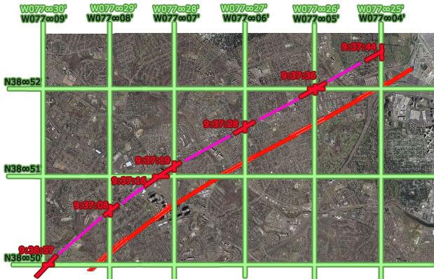
Which becomes interesting when it tries to line up with real-world grid lines, mapped here with the same curve from above matched with the official final trajectory and impact point.

A literal mapping would make no sense, putting the path consistently about 20 miles off to the west via the massive longitudinal offset previously calculated at about 22 minutes (about 1/3 of a degree) – but here I took the west-offset arbitrarily as a whole-minute difference of 21' to match closest lines in the area - W077∞30' mapped over W077°09', etc. Any possible north offset was ignored, with latitude lines placed the same (38∞52' mapped as 38°52').
The flight paths don’t match up, evidencing a north deviation of approximately 20 seconds north of real. The west reading appears roughly on with the 21 minute offset, but on closer inspection syops a bit short. The exact end point is less clear; considering one second left from the csv's last frame 'till impact, about 3-4 seconds at current rate to reach Pentagon from 04 line, this puts the readings again around 20-25 geo seconds too far west.

Csv flight path and corresponding grid shifted to match official flight path:

The Offset is roughly square or perhaps proportionate to the rectangular parcels marked out here – about a third of a minute on each side. So the West offset is now set by me at about 21’20” West and 0’20” north.

Sunday, August 26, 2007

NTSB ANIMATION INTERNAL GEOGRAPHY, PART 4: LATITUDE COLOR TRACK

NTSB ANIMATION INTERNAL GEOGRAPHY, PART 4: LATITUDE COLOR TRACK
Adam Larson / Caustic Logic
The Frustrating Fraud
rough draft, last updated 8/29 early am


The Color Track System
The tedium of mapping out the otherwise-ignored and probably irrelevant global grid beneath the plane in the NTSB animation is finally paying off, and looking at the east-west latitude lines passed or paralleled on the screen, I’ve made some interesting discoveries.

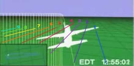
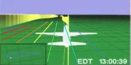
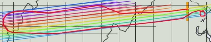
I have identified eleven latitude lines of note that frame the flight’s north-south dimensions and run along its east-west axis. I color-coded each line individually tracing it, continuously through its flight. each line is verified at multiple points as contiguous, parallel to its neighbors, and having a steady relation to the evolving flight path/ground track – in generally far more parallel than is warranted for real-world latitude lines but a general good fit for lines oriented to magnetic north.

1-blue – northernmost, never crossed
2-violet – next line south
3-purple – the most consistently paralleled line on the outbound flight.
4-magenta
5-red
6-orange
7-yellow – actually the first line crossed at the runway
8 –green
9 – aqua – the most consistently paralleled line on the outbound flight.
10 –sky blue – southernmost line actually crossed
11 – dark blue (intermittent, never crossed)
Here are lines 4-11 as seen at 9:07:39, headed more or less east (84 magnetic at this spot). Note that here on the south side, the exact lines at or near to north half flight path are not entirely clear. Lines 2 and three are there as well but unmarked due to lack of clarity. Reading the south path from north yields similar results, but there are better views that illustrate the color continuity.

To show how I tracked them, I’m imbedding a rudimentary “animation” of several dozen frames made in Photoshop of stills from the animation with the colored lines traced on. This is version 2, with another version or two to come before I call it good enough. The music is my own, from '99.


Initially what I saw was something like this over the full flight path:
(new window for full size)
I think it's a bit wrong, arrived at by misreading the cross-points at the south turn slightly, and by copying the exact bend I had mapped out for line 3 (see below) for each line. But while this grid came close to explaining what the animation shows, there are some serious perspective issues at work, and the obvious point that there's no such bend visible in the onscreen "latitude lines." I'd guess a subtle curve would actually explain it better, but also started tinkering with some straight-line solutions. Straight lines visibly and logically make more sense, and are more likely correct. But compared to what's seen in the video, this one at least is off on significantly on several points.


Examples:
Yellow Track – Line 7


Just to start, I’ve marked the ends of the color-coded latitude lines as the flight path turns sharply south around 8:55 am, just after the takeover. Eight of the 11 lines (lines 2-9) are crossed in this ominous maneuver roughly as mapped out below. Note where line 7 (yellow) crosses at the west end of the path, during the turn at about 8:58. Keep this location in mind as we shift attention to the other end(s) of the flight path.

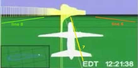
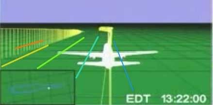
The yellow line continues down the middle of the space between the outbound and return flights. At the other end of the bent, elongated horseshoe flight path, the line still runs and is visible in both directions. Just after takeoff - 8:22 am the plane is paralleling line 7, line 8 visible to the left just north of the return flight ground track (and line 9 – aqua – is also there but not clear enough to mark), and 6 to the right. Perspective here is fierce, and the picture gets clearer as the plane gets higher.

Here it is an hour later as it neared the same point; this is the bottleneck of the flight, where we can see an easier point for referencing the other side and establishing continuity. There are about 2.5 parcels marked out by three lines running between the two paths, and the angle is clear to see. If these are east-west lines, why is the plane angling to the right in both directions when it was supposed to be southwest then northeast, and should slant to the left?

Purple Track - Line 3
In the video above, watch from frames 12:34:48 to the south turn.The red line down the center is number 5, the magenta number 4, and purple is number 3, which is interesting to follow. It first passes under flight path at about 8:36, during northward turn. Line 2 (violet) is also barely passed a minute or so later and then paralleled, though the plane remains south of line 1 (blue) the whole time. Follow the track ahead a few frames, and notice that as the plane corrects back to the south it passes near line 3, but the ground track never again touches or crosses it until the south turn at the end there.
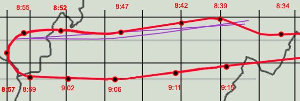
In order for this single line to both cross during the north sweep and again as it turns south, at least as I’ve plotted those points, it could not be east-west in relation to the official flight path. The most logical conclusion is that it has a slant, shown here as the straight purple line. However, the ground track does not cross over or touch this line again in the animation between these two points, as it would at 8:47 if a straight slant. In fact it almost seems to bow around that point from slanted to true east-west. This may sound strange, but compare the straight slant to the bowed line with what’s seen in the animation and tell me if this doesn’t fit better. Or is the roughness of my graphics, like the placement of 8:47 plot, enough to throw this off and insinuate a bend?
---
Aqua/Sky Blue Track – lines 9 and 10
Line 9, coded aqua, is the one most closely paralleled on the return flight. The third southernmost line, it’s first intersected by the ground track around9:01. Line 10 (sky blue) is to its right (south), of course also closely paralelled. Together they frame its return flight. 9:00:39 - just after the south turn but straightening out to head east - lines 3-10 shown here – line 9 (aqua) is just south of the ground track here, but the plane soon crosses so it’s to the north, and then evens out and parallels right over for a while. The cross-point for line 9 is further out than it seems, and is clearly not parallel here (as I said in the video - above - will be fixed in version 3).
Despite 20 minutes travel and a recorded northward turn, line 9 is still running parallel and near the ground track, which is only slowly approaching line 10 (sky blue). Now – heading slightly northeast (mag heading 90, 80 real) – should it be trending slightly south between “latitude lines?”

And finally tracing the lines through the final approach loop, we see that aqua line 9 is the one that crosses the Pentagon overlay map. I'm not able to match this with my path here without a final curve, but again, the red path is less than perfect (I had similar troubles matching up line 7 after takeoff). Either way, this rough intersection gives us an end point to draw a more precise track of lines 9 and 10.
Looking for traight line solution, none seemed to work for all points. But I was able to soften the curve greatly and found the best fit, much better than my bent model above. On the whole it’s effectively straight, so I’m thinking now the lines are most likely straight but clearly slanted from reality. I keep seeing a curve if not a bend, but it's subtler than I thought,and possibly an illusion from my flight path graphics' imprecision (I have below corrected at least one small spot, placing 9:15 a few minutes further north to match the csv, which helps the straight lines fit). This graphic shows a curved version that works quite well along with the closest fit straight solution (lines slanted at about 83 degrees, seven degrees counter-clockwise from reality). Note the marginal difference.
---
To come: the final map of all lines that works best at all points then I am done with this stupid subject.
Then final grid analysis and overlay map rotation issues relative to that and then I'm really done.

Saturday, August 25, 2007

BARBARA HONEGGER

THE PSYCHIC MUNCHKIN BEHIND THE HOLY GRAIL
Adam Larson
Caustic Logic/The Frustrating Fraud
December 15 2006


Perhaps the oddest case in the small but fertile world of government functionary-9/11 Truth crossover is that of Barbara Honegger, a dedicated but elusive and little seen 9/11 warrior with murky roots (apparently military and intelligence). She was allegedly into weird parapsychic stuff, channeling voices of supercomputers from the future and whatnot, [1] before she went to work in the late 1970s for a rising star named Martin Anderson at the Hoover Institute (where he remains as a Senior Fellow). She then followed Anderson to the White House as an assistant to join the Reagan-Bush transition team in 1980. Anderson advised Reagan on everything from foreign intelligence to education, finance, and arms control, probably worked for Bush sr., and during the Clinton Years focused on teaching classes at Stanford (home of the Hoover Institute and where Condi Rice was briefly provost). Anderson was later an advisor to George W. Bush in his 2000 presidential campaign, [2] and eventually became a member of Rumsfeld’s influential Defense Policy Board in 2001. [3]

Honegger_White_House
Muchkin Honegger smiling with Reagan and Bush in the White House.
Honegger herself had split off from her Republican benefactors early; she only served the Reagan White House as a researcher and policy analyst until she resigned in 1983 under unclear circumstances – either over sexual discrimination or something else. In May 1985 Newsweek ran a piece on Honegger titled “The Munchkin's Musical” that stated “White House aides began whispering that Honegger was a believer in ESP who claimed she'd ridden on Halley's comet.” [4]

At the time she was also among the first to have leaked details of the “October Surprise” scandal, much of which was later verified by numerous involved parties. The deal was allegedly made by George Bush and William Casey to delay the release of the hostages in Iran - a delay that cost Carter the White House and gained it for Reagan and Bush. [5] Her charges culminated with the 1989 book “October Surprise,” predating Gary Sick’s work of the same name (which does not mention her) by two years. In the end, the scandal cost Reagan nothing, covered up by an investigation headed by a certain Lee Hamilton, who would go on later to 9/11 Commission and Iraq Study Group fame. Honegger later left a small mark on the Iran-Contra scandal, carried out as it was by largely the same networks responsible for the October Surprise, continuing to weave a picture of Bush-centered intrigue.

Despite all this, she not only remained alive but went on to tie Bush's son and former Defense Secretary in with carrying out 9/11, her works on which carry the disclaimer "all of Honegger’s research and publications on September 11 are solely in her capacity as a concerned private citizen and do not imply official endorsement." This is because in 1995 she was given a cushy job as Senior Military Affairs Journalist at the Naval Postgraduate School, which she holds till the present, writing about such things as a cyber-defense exercise in 2002: “all the National Security Agency’s Trojan horses and Air Force and Army’s info-warriors couldn’t break through the cyber walls erected by the Naval Postgraduate School’s ace “Blue” Team,” she wrote. [6] How ironic then that what some suspect of being NSA Trojan horse 9/11 arguments should have eventually broken through her psychic shields and into her research.

Honegger’s role in the 9/11 Truth movement is huge and will perhaps go down as her crowning achievement, for good or ill. Her legacy here is centered on revealing to Mike Ruppert inside info on the War Games of 9/11 which scrambled the defense and were probably co-ordinated by a Maestro working for Dick Cheney. These revelations formed what Ruppert called “in my opinion – the holy grail of 9/11 research,” and a key point for the smarter edge of the movement at large. [7] Her credentials thus seem solid, but her later works I’ve seen are sloppy and full of holes and leaps. In October 2004 she reportedly told a forum in Los Angeles that “shoe bomber” Richard Reid was really Osama bin Laden, who apparently dyed his hair, trimmed his beard, removed a few wrinkles and turned himself in as it were by trying to ignite his shoes on a trans-Atlantic flight. [8]

Honegger’s later works include "The Pentagon Attack Papers," published as an appendix in Jim Marrs’ “The Terror Conspiracy,” 2006, taking her squarely into this blog's turf. In her Pentagon analysis, she argued against a big plane and for a traditional bombing. This, she's certain, happened at 9:32, with anything happening at the official time of 9:37 being some sort of cover – possibly the impact of “an airborne object significantly smaller than […] a Boeing 757.” She cites a mixed bag of evidence, from hard fact like a stopped clock to repeated government “slips” to irrelevant coincidences, and has cited war games at the Pentagon that morning, which are unverifiable but likely incorrect. [9] (I will post on this theory in more detail sometime soon).

She has also tied the alleged original pilot of Flight 77 before it was hijacked, Captain Charles Burlingame, to “a Task Force that drafted the Pentagon's emergency response plan on what to do in case a plane hit the building.” She appears to be the source of the similar charge laid out in Loose Change, second edition’s opening segment. It’s an intriguing possibility, but it doesn’t help her tentative case that she then finds it “extremely likely, if not certain - that this 'task force' that […] Burlingame was part of was
the Cheney counterterrorism preparedness task force, and that the Pentagon plane pilot, therefore, directly knew and even worked with/for Cheney.” [10] Maybe that parapsychic training is helping her to fill in the gaps with right-brain impulses or insights from the future that make it all make sense…

No more promising is her citation of “the already legion evidence that Flight 77 did not hit the Pentagon:" “the small hole in the west side of the Pentagon being not nearly large enough for the plane’s fuselage, let alone wing width," "no damage to the lawn where Flight 77 allegedly struck and skidded before hitting the building," "wrecked plane parts at the site identified as being from an A-3 Sky Warrior, a far smaller plane than that of Flight 77, a Boeing 757.” [11] Of course my debunkings are legion as well, or getting there. "The small hole" - the unmarked lawn - the plane parts - The A3 Sky Warrior Theory.

While her reputation in the movement is generally sterling and I don’t know enough to cast large stones, these aspects of Honegger’s works – her unexplained leaps, need to tie Cheney in personally, and especially disagreeing with me over the Pentagon evidence - are deeply flawed. Whatever her intentions, she has served as a useful and strangely credible-seeming source, and also a comet-riding psychic moonbat in the employ of the US military pushing among the worst 9/11 theories. That doesn't prove anything but it's worth considering.

Sources:
[1] http://www.mindcontrolforums.com/mindnet/mn202b.htm
[2] “2001: Mr. Hoover Goes to Washington?” Myszewski, David. Stanford Review. Volume XXV, Issue 6: January 2001
http://www.stanfordreview.org/Archive/Volume_XXVII/Issue_7/2001/
[3] Martin Anderson: Keith and Jan Hurlbut Senior Fellow. http://www.hoover.org/bios/anderson
[4] Source lost... I'll check at the library and get back...
[5] http://www.spartacus.schoolnet.co.uk/JFKhonegger.htm
[6] Honegger, Barbara. “NPS Aces Second Annual DoD Cyber Defense Exercise.” http://www.nps.navy.mil/PAO/Internal/Cyber_Defense.htm
[7] Ruppert, page 336.
[8] Propaganda Patterns: Official Stories, Limited Hang Outs, Best Evidence, Distracting Disinformation
a political map of political collapse and possibilities. http://www.oilempire.us/propaganda.html
[9] Honegger, Barbara. “THE PENTAGON ATTACK PAPERS: Seven Hours in September: The Clock that Broke the Lie”
Appendix to THE TERROR CONSPIRACY by Jim Marrs. Publication date, Sept. 6, 2006 http://johnmccarthy90066.tripod.com/id206.html
[10] "War Games" by the US military on 9/11: paralysis of air defenses that ensured the success of the attacks? who coordinated these efforts?” http://www.oilempire.us/wargames.html
[11] See [9].

Friday, August 24, 2007

CSV / ANIMATION / OFFICIAL FLIGHT PATH AGREEMENT

CSV / ANIMATION / OFFICIAL FLIGHT PATH AGREEMENT
Adam Larson / Caustic Logic
The Frustrating Fraud
August 24 2007


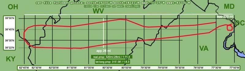
A small post to tide my swarming readers over until I finish my animation geography analysis; I recently found, for what it’s worth, both the animation and the csv file seem to agree with the official story [ed - on this issue - the general flight path]. This is nothing new, of course, but barring minor variations of whatever significance, and looking at the 320-mile long swathe of land flown over by Flight 77, it’s all a remarkable fit.

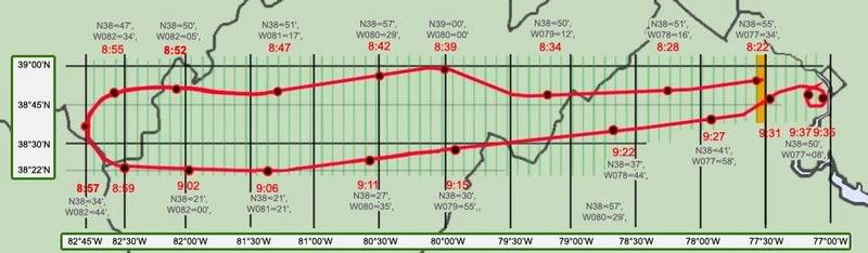
Earthtools tells me the furthest point west in the official path is about 82° 44' 56” W, while the csv file records 83°06’ as the largest west number. These two numbers are off by about 21-22 minutes (no seconds recorded in the csv so exact margin cannot be determined), or about the margin they’re off by for the whole flight (explained here). So the official story and the csv file (corrected) match on lat/long readings at the furthest point west, and they also match at Dulles and the Pentagon; by being about 22 degrees apart across the board, they verify the board. As for the animation, I ignored its apparent lat/long grid appearing consistently off, and just used it to place the plane roughly at given times on its flight path (for example, just before a left turn at 8:39).

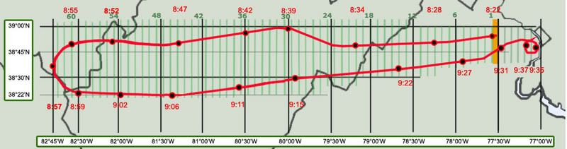
I made this map by stretching the 9/11 Commission’s flight path map w/state borders to fit a larger map of those borders. I then recreated the path (a bit rough in the curves) for greater clarity. I set the lat/long grid lines beneath it with Earthtools. Along the flight path, I marked 19 timed locations at key times. These were first plotted visually according to the animation, and then fine-tuned with the csv file (west corrected).

Note the remarkable, if not exact, correlation of all these data sets. The plots are off by a few minutes here and there, but on the scale of this 320-mile long swathe it all generally lines up. This is not surprising of course, as the Commission’s map and the official story in general have always relied on the flight path first downloaded we’re told within days of the attack. Just take this as another verification that the official data all lines up on the big picture flight path issue, and another excuse for me to publish a cool new graphic.

Tuesday, August 21, 2007

NTSB ANIMATION INTERNAL GEOGRAPHY, PART 3: GRID CLUES: ORIENTATION AND PROPORTIONS

NTSB ANIMATION INTERNAL GEOGRAPHY, PART 3: GRID CLUES: ORIENTATION AND PROPORTIONS
Adam Larson / Caustic Logic
The Frustrating Fraud
August 21 2007
last updated 8/22, 1:00 pm


I had promised a piece on the grid's "latitudelines," but that one will take a little more work and could use some foreshadowing, and so here are four clues to what I'm starting to decide on...

Regarding the background grid of the NTSB's Flight 77 animation, the questions of rectangular parcel proportions and overall northern orientation are closely related. Wondering how it’s oriented may seem silly; one would presume the Safety Board’s experts, if not the FDR itself, would correct what the compass knows and show the plane on a true east-west north-south grid, with the magnetic headings showing up off from these (to almost exactly ten degrees) as they would have in real life. This does not seem to be the case.

Four clues:
1) Mini-master map:

the full flight path is reproduced in the small window at the lower left of the animation screen and offers clues to both proportions and slope. Here is a screen cap with enhanced lines vs. official flight and real lat-long lines crossed. The animation seems to stretch the flight path over almost three squares. Undertow pointed this out to me, though I’d noticed it before, and it’s definitely a possible clue. If these mark some amalgamation of the onscreen rectangles, they should have the same proportions as those smaller parcels. That is, if a block of say 60 minutes by 60 minutes is square, a one-by-one minute unit should also be square. There is also, obviously, an angular slope evident between the two; the lower portion, again, shows the true east-west orientation of the official path, while the grid lines around the animation’s mini-map are rotated about 8-9 degrees counter-clockwise, just about consistent with magnetic north (declination 10.08 degrees).

2) lines at 270°
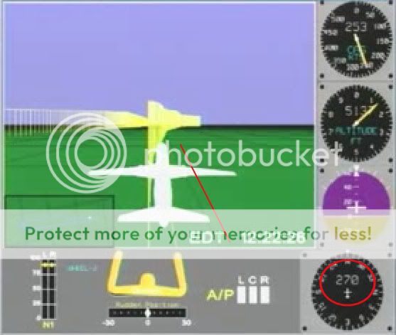
At 8:22 am the plane has a heading (nosecone orientation) of 270 degrees - due west from magnetic north, just southwest of west in true terms. It's just about parallel with the nearest latitude-looking line, and perpedicular to the longitude lines ahead. As for parcel proportions, they look fairly square here. However, perspective at this fairly low altitude of 5137 feet is fierce and makes it unclear and inconclusive.

3) Lines at 180°
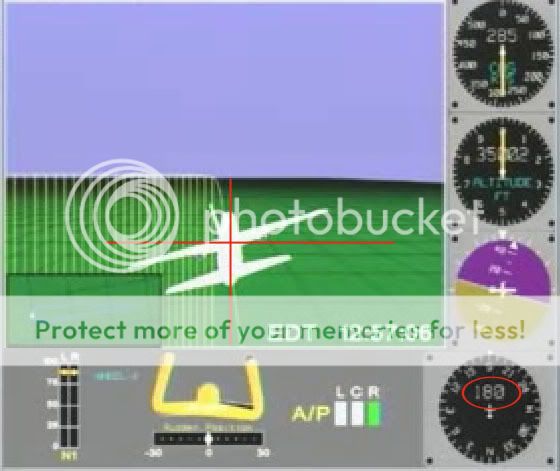
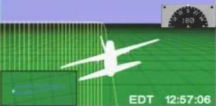
As the plane nears the mid-point of its southward turn, at 8:57, the longitude line under it shows exactly vertical, and latitudes ahead of it exactly horizontal. The heading dia shows 180, or due south. This would make perfect sense if the grid were oriented to magnetic north. These rectangles also look remarkably square seen from an elevation of over 35,000 feet, as opposed to the roughly 5:7 proportions of latitude/longitude intersections there in the real world.

4) Lines at 70°
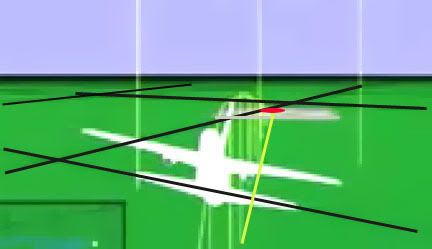
I wanted to analyze the final trajectory shown in the animation in relation to the global map, but found that harder than due west and south. To start with, here is a frame with grid lines, Pentagon location, and track (flight path along the ground) highlighted. The magnetic dial hovers right around 70° from north on this final track.

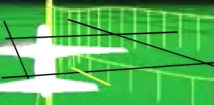
At right is another view from just before the grand loop show just where on that parcel’s west edge the ground track crosses. I figured If I marked this and de-skewed the parcel I could masure its angle of incidence.


To measure this angle for sure, I’d need to know the proportions of the rectangles, something made difficult by the foreshortened perspective. Again this looks fairly square to me, so just on a hunch I ignored real-world lines and tried de-skewing the grid there into a square. This is all a bit approximate, so don’t expect precision to more than a degree or two.

Interestingly enough, we get almost exactly 70 degrees, which is what the FDR says on that path (both in the CSV file and the animation’s heading dial). Subtracting 10 degrees for magnetic declination, we have the official trajectory of 60 that matches the physical damage.

On all four points above, the flight path reads correct in angles relative to its own internal geography, but not to real-world lines, in either placement or slope. From this, my best guess at the moment is that the animation program is pointing its longitude lines to magnetic north, and its latitudes perpendicular to that, throwing the whole grid off by a rotation of approximately ten degrees. And on top of that, it's generating a square grid map, unlike real-world lines, in which latitude lines are further apart than longitudes. This equilateral proportion indicates the flight path may've been rendered at some default equator on this globe rather than at the proper latitude. If the lines even represent latitudes and longitudes at all and not some other type of grid.

To see whether this is confirmed or denied by the latitude lines involved, I will be posting a detailed piece soon and even a short "video." In fact this is already up on Youtube and viewable at this link. Sorry for the low resolution and the choppiness of my frames. I hope it works - compare to the original animation if that helps.

PUNCH-OUT PAGE {Masterlist}


PUNCH-OUT PAGE {Masterlist}
Adam Larson/Caustic Logic
The Frustrating Fraud
Last updated July 16 2007


It’s long past time I worked out a study of the much-discussed but little-explained “punch-out” hole at the end of the plane’s trajectory through the Pentagon. The official story maintains that the disintegrating 757 plowed in a northeasterly direction clear through the E, D, and C rings of the building, the furthest-reaching elements from the fuselage coming to rest just outside the inside wall of the final ring, and into the open, ground-level service roadway past that – the A-E Drive that runs around the building between C and B rings. Burning debris was ejected with enough force to leave marks on the outer B ring wall, but otherwise stopped in the drive.
Russell Pickering of Pentagonresearch.com, who has studied the issue more than perhaps anyone else, aptly describes this exist wound as “one of the most anomalous features of the Pentagon attack […] absolutely inexplicable in terms of the composite nose of a Boeing 757-200 "punching out" through it," given "curiously little" of any plane parts outside of it. [1] It’s a perfect hole implying strong, evenly applies force and yet no ready sign of just what part of the plane made this and then - apparently - vanished before hitting the next wall.
Here is the earliest photo Pickering could locate of the hole, before any marking were spray-painted and before the debris inside was pulled forward. Note the ground is strewn with scattered bricks and flooded with water from firefighting efforts. [2] Compare this with with the damage to ring B's wall across from it [below], separated only by fifty feet of air; not a brick removed. [3]
Only a few photos of the exit hole have been released, many had seen it, and none have explained it with any useful precision. It has proven a magnet for mystery-mongers and skeptics from across the credibility spectrum.

How exactly the plane's trajectory wound up giving us what we’ve seen is left a bit vague in the official record.
- official "explanations:" confusion/silence over the exact cause of the hole.

- Analysis of the plane debris at and near the site.

- Carlson's backhoe punch-out theory assessed for errors

- Possibility of a purposeful, explosive punch-in

Personally I cannot venture a solid guess as to what happened here. The hole was either cut out with explosives for some reason or somehow caused by the barreling 757, perhaps via debris that was removed before the pictures we’ve seen were taken. I’m certainly open to suggestions. But I have to agree that IF there is a physical crime – an inside job element to the Pentagon attack that can be shown with evidence - this is the most likely spot to look.
---
Sources:
[1] Pickering, Russell. “Exit Hole” Pentagon Research. http://www.pentagonresearch.com/exit.html
[2]. [3] Photo Source: Pentagon Research. Exit Hole Chronology. http://www.pentagonresearch.com/062.html

Thursday, August 16, 2007

CSV/ANIMATION ALTITUDE DISCREPANCY

CSV/ANIMATION INITIAL ALTITUDE DISCREPANCY
Adam Larson / Caustic Logic
The Frustrating Fraud
August 16 2007
last updated 8/21


Note: Pilots for Truth senior member “Undertow,” who I admit has far more knowledge in this area than I, commented on the following piece “You can not possibly be this moronic about this. Please for the love of god stop confusing everyone.” (see comments below)

I read this as his seeing too many mistakes to be accidental, and so it’s probably an attempt to confuse, a feeling I'm familiar enough with. No, in fact, I can be, and was, this moronic. I am off on a lotta spots here, numbers and otherwise. Sorry, I was tired and inspired at the same time. The general gist is still right, but numerous minor alterations and further notes are to come… (in red) Apologies for any remaining confusion and please don’t take this as a final word on anything without consulting a non-obfuscationist expert first. In fact I'm not even saying much at all here.

But as “mod” says below “CL is going in the right direction IMHO. What does the Video say vs. the CSV file, in terms of pure numbers? 99% should match.” I also feel I’m onto something here or I wouldn’t’ve posted it… I just don’t know what yet. Maybe it’s nothing. But UT’s vehemence has inspired me: “Jesus, please stop and really think about this before posting anymore absolute nonsense.” Have done, and I got lots of red here now. Jesus. I'm done.

For more in-depth, piloty, and udeful analysis of pressure altitude readings, please see the lively and enlightened Pilots for Truth discussion thread at this link. Hopefully you're a member, or perhaps they'll provide me with a better link to help explain what I'm missing here. Otherwise do your own research or just hang tight to see what I come up with.
---
Where I was Wrong
Aha! I feel stupid but not really. I had previously concluded that the original, takeoff altitude for Flight 77 in the csv fille matched the same in the NTSB animation. It turns out I was incorrect. It was a mistake on my part but kind of odd how easily it lent itself to misreading.

1) The actual altitude at Dulles is about 300 ft msl as I’d heard. I verified this with Earthtools; runway 30 is on an slight uphill slope from about 285-295 feet MSL. I’ll call it 290.

2) The NTSB animation shows precisely 300 feet in the altitude dial on the ground. It’s not quite right, but close enough to be accurate. It also happens to match almost exactly the magnetic heading on that runway of 300 degrees from magnetic north, also displayed as 302 with the plane at rest.

The csv agrees on mag heading and lists it as 302 for the long runway pause, which is where I got mixed up. When I first dug in for altitudes, I saw it was luckily only the fifth of several hundred settings so would be easy enough to find. I had heard takeoff altitudes matched, so looked first for an altitude of about 300, I counted over five, six, whatever values and saw 302. Not realizing it was actually the mag heading, I took it as a verification of the animation’s rough accuracy. The reason I missed the actual pressure altitude is that it’s unusually different from the display alt at that point, while the mag heading is still much closer, if it were altitude in feet. And they’re listed right next to each other so I got mixed up.

In fact the beginning altitude listed in the csv is 40 feet, 250 feet too low to be accurate. This is a point of disagreement I haven’t heard anyone mention yet, though Undertow tells me I’m “covering ground which we plowed last summer.”

Tho it didn't come across as I noted a discrepancy, I do also understand the csv and animation attitudes should not exactly match – as UT usefully points out “The FDR produces a Pressure Alt and Baro column in the CSV. Together they create what the pilot would see on the Actual Alitmeter. Which is what is supposed to be shown in the Animation.” That is, the pressure alt reading “+” barometer correction = real altitude. The exact relation and expected differences I’m not totally clear on but getting there [another post]. What I'm really noting here is a massive difference I hadn't noticed before, apparently the mirror image of the 300-foot part of John Doe X's correction.

Tracking Back
I stumbled on this error while looking into another, related anomaly, a search that involved lots of backtracking. I saw that the final altitudes at 9:37:44 are near identical – 180 for the animation’s dial and 173 for the csv (of course they aren’t supposed to be, because of the omitted barometer reset). This final altitude is however misleading, and seems to be from a frame of data that didn’t play out and would have left the animation considerably lower. In the four seconds before that, the two reading carried a rapidly decreasing difference of 50 feet to 28 feet, with the animation lower. I didn’t bother tracking this discrepancy, but noted that they match up closer back around 9:24 (animation about 15-20 feet lower than the csv), both before and after the mysterious FL180 reset recorded in the csv that had no effect on the animation readout.

So clearly the altitude difference between the two is all across the board, but nothing in the difference range of hundreds of feet. Tracing back further, they also match roughly after the initial FL180 reset on ascent (at 8:28) with difference of 20-30 feet but with the animation higher this time. Since it reads lower near the end, there is a roughly 75-foot fudge room, at least, between the two, that comes in somewhere between 8:28 and 9:24. I don’t feel like tracking this down, especially since I had been looking for something else.

An Inexplicable 240-foot Gap
At the initial FL180 reset, on ascent, at 8:28, Pandora’s Black Box shows an altitude drop from 18273 to 18058, a difference of 215 feet. Despite having matched the csv before that (I thought) and after being only about 27 feet off. There is 242 feet of total discrepancy here, most of which is lost at 8:28 leaving a near-match after, which means the animation must’ve been set much higher than the csv before the change. Another error of the cartoon, no doubt.

I’d never noted it before, but lo and behold, the altitudes do not match before that onscreen drop. The difference is in fact about 280 feet, animation high. Since I “knew” they matched on the runway at 8:20, I traced it back over the intervening eight minutes to see where the discrepancy crept in. Actually I started at the beginning and made the same mistake of identifying 300 and then watched for the up-tick to match the animation after it started rising at 8:20:16. I suspected the csv would be slower, but it remained at about 300 all-down the 300-oriented runway second after second as the animated plane rose. Then I realized I was looking at the wrong column, that the discrepancy runs back to the first frames and the csv file’s original altitude is wrong – to the tune of 250 feet underground, the same discrepancy nearly erased with the onscreen altitude change (leaving as the remainder the smaller discrepancy).

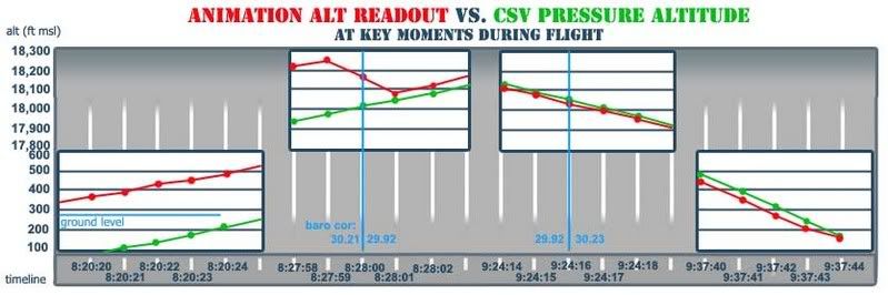
Here is a table of data at the relevant points: "baro cor" is the setting re-set at 18,000 feet both ways, once apparently by Capt. Burlingame, once by capt. Hanjour. + differences mean animation high, - means csv higher than animation.
time |baro cor | anim alt | csv alt | diff.
8:20:15 | -- | 300 | 59 |+241
8:20:16 | 30.20 | 304 | 52 |+252
8:20:17 | -- | 311 | 49 | +262
8:20:18 | 30.21 | 323 | 53 | +270
8:20:19 | -- | 339 | 61 | +278
8:20:20 | 30.20 | 363 | 83 | +280
8:20:21 | -- | 392 | 111 | +281
8:20:22 | 30.21 | 420 | 144 | +276
8:20:23 | -- | 456 180 +276
8:20:24 30.20 494 210 +284
8:20:25 -- 530 248 +231
8:20:26 30.21 568 290 +278
8:20:27 -- 614 330 +284
8:20:28 30.20 662 372 +290
8:20:29 -- 704 417 +287
8:20:30 | 30.21 | 755 | 469 |+ 286

8:27:54 | 30.21 | 18081 | 17785 |+296
8:27:55 | -- | 18129 | 17823 |+306
8:27:56 29.91 18140 17861 +279
8:27:57 -- 18179 17899 +280
8:27:58 30.21 18219 17938 +280
8:27:59 -- 18252 17976 +276
8:28:00 29.91 18166 18015 +151
2:28:01 -- 18083 18056 +27
8:28:02 30.21 18118 18093 +25
8:28:04 29.91 18198 18170 +29
8:28:06 | 29.94 | 18278 | 18247 | +30
… …
9:24:10 | 29.92 | 18264 | 18285 | -21
9:24:11 --- 18222 18245 -23
9:24:12 29.91 18185 18205 -20
9:24:13 -- 18151 18168 -17
9:24:14 29.92 18106 18126 -20
9:24:15 -- 18071 18088 -17
9:24:16 30.23 18030 18049 -19
9:24:17 -- 17993 18011 -18
9:24:18 | 30.01 | 17956 | 17972 | -16
… ... ...
9:37:40 | 30.23 | 445 | 496 | -51
9:37:41 --- 351 399 -48
9:37:42 30.24 279 307 -28
9:37:43 --- 211 239 -28
9:37:44 | 30.23 | 180 | 173 | +7
---
Here is the graph of five seconds at each of the four key spots. One can see how a roughly 300-foot jump in the animation altitude (red) would be expected at the second re-set. I'm not sure what exactly to make of this, this is just to illustrate. (view in new window to see it full-size)

Clearly, there is a massive discrepancy only for the first eight minutes of flight and back on the runway. So this piece stands as two points:

1) I correct myself on a silly mistake – the initial csv altitude I had previously worked with was grossly wrong
2) Whether or not they should, the animation dispaly and csv pressure altitudes roughly match all through the flight, as I have previously noted, except for these first eight minutes.

And since I just now figured this out I don’t want to say what it means – if the JDX correction is boosted by this or if this reveals something else. That's in the math I'll do a bit later. But it cleary raises questions about the data itself, if not about what physically happened.

Monday, August 13, 2007

NTSB ANIMATION INTERNAL GEOGRAPHY, PART 2

NTSB ANIMATION INTERNAL GEOGRAPHY, PART 2:
LONGITUDE LINES
Adam Larson / Caustic Logic
The Frustrating Fraud
July 12 2007
Updated Sept 3


As a primarily west-then-eastbound flight, 77 would have crossed more n-s running longitude lines than it would latitude lines. So in mapping what the NTSB animation shows in comparison to reality, let’s start with this more tedious operation with a larger room for error before the more delicate reading required for the latitude lines.

This map is based on the official path in the 9/11 Commission Report, with real-world latitude and longitude lines mapped behind it. I’ve marked longitude lines (vertical, running to the geographic north pole) at the degree and 30-minute marks, and the latitudes at intervals of 15 minutes, with the exception of the westernmost and southernmost lines, which are where they are.
right-click, new window, for full-size

Full proportions of the flight:
Flight 77’s takeoff coordinates, which I’ve taken as the end of runway 30 at Dulles, are 38 degrees, 56 minutes, 40 seconds north of the equator (38° 56' 40" N) and 77 degrees, 30 minutes, 11 seconds west of Greenwich. (77° 30' 11" W).

furthest point west: 82° 44' 56" W (83°06 by the NTSB's csv file, which is 22 degrees off)
furthest point east - 77°03’30” (again, 77°25' by the csv)

Total distance traveled west from Dulles:
82° 44' 77° 30' = 5° 15'
5.25 degrees, about 295 miles, 315 minutes, 18,900 seconds.
Lateral return distance to the Pentagon: 320 miles from furthest point west, just under 5.75 degrees, 345 minutes, 20,700 seconds.

So one thing to note here is that the official story's east-west-locations match the plots recorded in the csv; that is, by being about 22 degrees apart across the board, they verify the board. Now that we’ve parceled up reality with a multiple corroborated map, let’s see what the animation shows for longitude lines crossed. If the rendering program were marking at degree lines (77, 78, 79...), we’d see only five of them crossed on the way out. If they were marked at the 30-minute points as I’ve done here, we’d see 11 of them, and 314 if split up at the minute level. If they were marked wherever else…

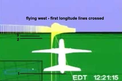
Looking at the animation, the first longitude line crossed comes soon after leaving the runway. This line passes off-screen at about 12:21:15, or 8:21 am, by the animation’s time code. The second line is crossed around 12:22:10, and so on every minute or so thereafter.
For example, line 23 is passed around 8:34:15, after which the animation shows the plane turning north, with line 24 and the next passing off-screen around 34:40, 35:15, 35:50, etc.

The last lines are hard to read, as the plane turns south to head back. The plane turns sharply to the left after 8:54, just after the hijacking commenced, making the ground track hard to follow. The final lines were crossed more slowly; line 61 would have been crossed around 8:54, and the final mark passed obliquely around 8:55:30, nearing but never crossing the next longitude marker as it turned to a south bearing of 180 at about 8:57, and kept turning to point east and return.
So I may be off by one or two lines, but this is a large enough sample that I’ll say close enough. Sixty-two perpendiculars passed means 63 marked longitude zones traversed on the initial westbound flight, and one would presume a few more on the return flight that overshot the origin by a 20 miles. On the map below, I marked 62 vertical lines, evenly spaced (to a pixel or two), and stretched it over the flight path from just after the origin point ay 77° 30'. It lines up roughly with an interval of five minutes real, there being an average of six divisions to each 30’ interval.
right-click, new window, for full-size

Mathematically, it also happens that 5 times 63 gives us 315, the number of minutes I figure were passed. So whether by design or not, the global map is marking intervals of about five minutes on its east-west axis. This would mean 12 markers per degree, which seems an odd but logical enough system. It does simplify the reading of it; no way would I have tried to count 314 passing blurry lines.

Or it could be a coincidence that my imprecise reading closely matches such a possible system. Either way, it carries over into the final stretch before impact. Presuming the same 62 lines crossed until the plane passed south of Dulles, It seems the return flight tops it by another six. The origin zone is entered at about 9:29:30 in the animation, the first line east of there crossed soon after, and then five more. The sixth line is the only one crossed twice; at 9:34 as it starts the 330 southward loop, and again as it straightens out from this and dives to its terminus, nearing but not passing the seventh longitude line east of Dulles. The proportions that described the westbound flight apply here as well, with the zone from 77:30-77:00 looking to be marked into about six parcels of five minutes each.

It’s possible that these lines do not in fact run due north, but are offset due to the grid being oriented to magnetic north. Trying to compare and calculate their verticality based on the visuals in the animation seems daunting. More precision is possible with the much fewer latitude lines. These seem to run near-parallel to most of the flight, giving us readable slants over certain distances. To determine both the possible slope of an offset grid, and to look at the proportions of the marked parcels, we’ll need to look at these presumably east-west lines, which it seems will require yet another separate post. This analysis will be far more interesting and its graphics more colorful; I’m seeing patterns that bring into question the global grid’s orientation and even internal consistency. Maybe. I’m still looking.

Wednesday, August 8, 2007

NTSB ANIMATION INTERNAL GEOGRAPHY, PART 1

NTSB ANIMATION INTERNAL GEOGRAPHY, PART 1
GROUND OBJECTS
Adam Larson / Caustic Logic
The Frustrating Fraud
August 8 2007
last updated 8/17/07


Real-World Lines?
I asked Rob Balsamo/John Doe X, co-founder of Pilots for 9/11 Truth “do the lines on the background map in the animation represent latitude and longitude lines?” I already had a good idea of the "right" answer I was hoping for, which he didn’t supply.

“It sure looks that way when analyzed vs. google earth.”

In a sense, the lines do mimic real-world ones by running north-south and east-west (roughly anyway - I haven’t ruled out a magnetic-as-real north discrepancy yet) and intersect at what seems right angles. Extreme perspective and (in my case) low resolution make these things hard to determine. But below I will show, at the very least, the markers laid down under the runway and final map either represent illogical marking points on real geography or, more likely, have no bearing whatsoever on the plane’s real location or the FDR data.
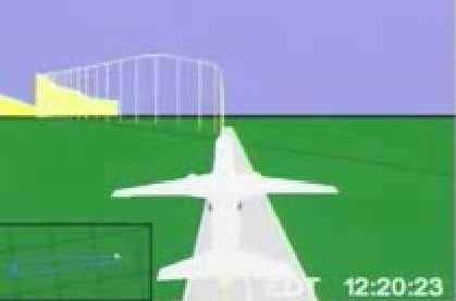
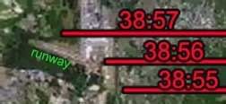
The first thing I saw that made me scratch my head was the latitude line that intersects the runway at takeoff, as seen above. Runway 30, at the south end of Dulles airport, points slightly north of west, for a compass bearing of 290 degrees real, and about the right angle to intersect a latitude line as seen on the rendered runway. But below is a map I made that shows the nearest major latitude lines: 38 degrees, 57 minutes, zero seconds (38° 57’ 00”) North, which does not intersect even this massively long runway, and 38° 56’ 00”, which runs just south of its base. The intersector could be 38° 57’ 30”, though it seems a bit odd to map this mid-point when the minutes are so close already.

While not conclusive in itself, this linear oddity makes sense in the context of this anonymous comment left at my blog using “we” when referring to the NTSB:

“The ground representation below NTSB animation of Flight 77 is not connected to the aircraft data that makes the plane move. The data from the FDR was used to make the aircraft animation, but there is no actual correlation to the ground. The NTSB animation is only a working copy and we never finished it to be accurate to actual ground objects.”

There was an effort to show ground objects, of course, with the rendered runway and the Pentagon overlay map relative to the pane at start and finish. With only these two points, the grid in between the two, and the plane’s movements to go on, I’m attempting to see how closely the animations global grid compares with real world lines.

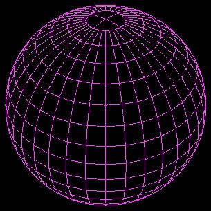
One thing about the grid map we should also see is the longitudinal separations being narrower than latitude. At the equator, the rectangles formed where lines intersect are square (the sides are “equated”). Latitude lines (east-west) remain parallel and equidistant, and are often called “parallels.” But Longitude lines (north-south) run closer together nearer the poles and in fact merge there. The net effect of this is that the parcels become narrower rectangles as we move north or south.

The Grid at the Pentagon
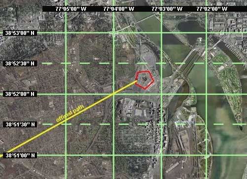
In the upper 38th parallel, the location of the Pentagon, the rectangles formed are at a proportion of about 5:7. In the map below, I also subdivided the latitude measurements showing the halfway markers at 30 seconds (30”). These are the dotted lines, and would probably not be mapped in an animation. The Pentagon lies between 38° 52’ and 38° 52’30” north, and 77°03’ and 77°04’ west, with point of impact at near dead center of that rectangle that would, by definition, be the rough area of the animation overlay map. Note that none of these lines crosses or touches the Pentagon itself.

If the animation’s map were set to real-world lines, its proportions around the Pentagon should look something like the graphic I did at left (dotted lines included for reference). Instead what get is the situation below, a slightly enhanced screen cap with Pentagon circled in red.


Did the Safety Board's experts shrink and shift the Pentagon here, so rather than dominating a third of the rectangle it’s a speck at its northeast corner? Looking closer at the overlay map, this latitude line actually crosses the northern third of the Pentagon, which is not what the real lines do.
These clearly are not latitude and longitude lines at the minute marks. While too big by far for that, they are far too small of course to be degree markers. Do these represent any real groupings of real-world lines (say every five minutes)? Or is this Perhaps this just some mappish looking grid meaning nothing at all just etched on to show “hey, this is some kinda globe.” Perhaps this is one of the shortcomings of the “working copy” they ironed out later in the process.

Three other questions remain under investigation: the proportions of the rectangles shown, the overall orientation of the grid lines (based on true north or magnetic?), and whether the final map is rotated relative to the program’s internal geography. These will take some more analysis, although in the last case it seems there's clearly some kind of rotation.