THE FINAL MAP: A TURN FOR THE WORSE
Adam Larson / Caustic Logic
The Frustrating Fraud
Finished Sept. 21 2007
updated 5/26/08
Very interesting thread at Above Top Secret when I posted this.
The Final Grid Analysis:
In my previous studies of the global grid beneath Flight 77 in the NTSB’s animation, I had found that the grid does not conform to real-world lines in proportion, scale, or orientation. I’m not 100% sure on the exactitudes of the final take seen below, but by multiple points of evidence it’s the best fit with what I was consistently seeing.
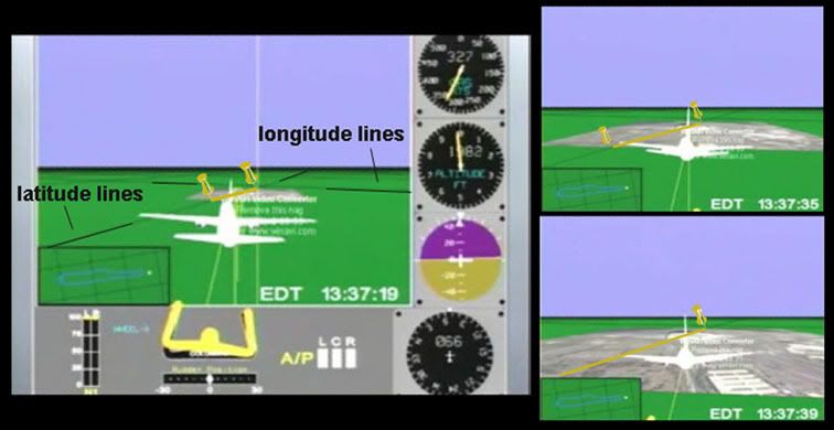
 This is based on extensive tracking of 11 east-west-ish “latitude” lines at multiple points in the animated flight as it crossed I think 68 apparent longitude lines. The official path shown here in red is oriented to true north, in agreement with maneuvers and time in the animation, and verified at multiple points as consistent with lat/log data from the csv file. So the red is pretty solid beyond minor variations in my graphics. The less-than-level grid seen here is also not quite straight. Straight lines just weren’t cutting it to explain all intersection points I noted, so I used slightly bowed horizontal lines. Whether or not this makes sense, the exact slant changes little over a 300-mile span; oriented about 6° CCW at the south turn (left-hand side) and ~9° CCW from due east around the Pentagon on the right.
 If the curve freaks you out, let’s presume straight parallel lines, but rotated in the neighborhood of 5-10° counterclockwise from real-world latitude lines. In fact, it’s at the high-altitude south turn end that I’m least sure, and lower altitudes at takeoff and near the end make readings there more precise. So if the lines are straight, they are in the upper range, no less than 8 degrees. The overall rotation looks close to magnetic declination, which I’ve established as 10.08° counter-clockwise at that time and location. This indicates that perhaps I read some crossings wrong enough that I’m off by a few degrees and the grid was rendered with magnetic north used as north. It doesn't sound very sophisticated for the National Transportation Safety Board, but something has got these lines off-kilter.
Anyway, we now have two different orientations to consider when looking at the animation flight path – the on-screen global grid relative to true geographic heading. So let’s throw in a third level that comes into play in the animation’s final seconds and the question that got me interested in this to begin with.
The Overlay Map: Tacked-On Straight?
This started from my investigation (independently and sloppily replicating the previous works of others) of the north-path aspect of the (working copy) NTSB animation. This of course shows a final approach north of the Navy Annex and Citgo station, ruling out the physical damage path and prepping mind’s eyes to accept the PentaCon witnesses just then emerging. The animated craft is shown headed towards impact on a heading of roughly 80 degrees real relative to the ground (90 magnetic), and yet the FDR data and the heading dial on the animation itself shows a magnetic heading of 70.0, consistent with the 60° official path.
The best guess I’ve seen around is that this overlay map was simply rotated the wrong way.
For example, JREF member Apathoid, with slightly different numbers than I have, decided “the animation flight path was off 21 degrees. Since magnetic variation in the area is 10.5 degrees, its safe to assume that, in the working copy given to PfT, the NTSB simply rotated the floor map the wrong direction.”
Adding my grid findings to the picture, it seems possible that a NTSB techie was told the grid lines were set to magnetic (actually about 10.1 degrees) and be sure to rotate the map to be accurate – so they did but turned it the wrong way. An even 20-20 split makes the most sense, which makes it tempting to call my grid rotation just off enough to account for ten degrees of this, and to seek the other ten in a rotation of the map counterclockwise from these.
Here are three screen captures from the final moments that show the approaching overlay, allowing us a glimpse of a single latitude line that, thankfully, actually crosses the map. I marked its intersection with the edges with tacks, and drew the yellow lines across the map to trace the parallel across. Note that the line crosses Pentagon’s northern third, which as I’ve shown elsewhere real-world lines do not.

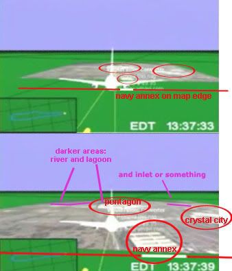
To analyze the content of the overlay map itself, I decided on the rough boundaries of it by analyzing the west (forward ) edge as the plane approached. I anchored this on the angle formed relative to the Navy Annex and the rough percentage of the map edge width it occupies. The back edge, and thus the scale of the map, is harder to read precisely, especially at this resolution. But I think it’s good enough; darker spots behind and to the left of the Pentagon seem to correspond to their lagoon and/or the Potomac, and some other dark shape is visible cutting the opposite corner.

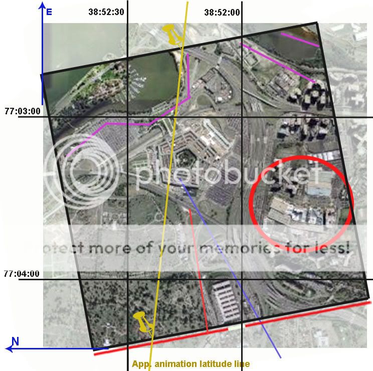
I mapped real latitude and longitude lines onto a Pentagon map rotated 90° counterclockwise to mimic the approach from the west. The red map edge is placed relative to the Navy Annex to delineate the west edge. The bold black square at an offset angle thus marks my proposal for boundaries of the overlay map - I presumed a square, which looks about right and gives us the waterline spots responsible for the dark patches. Note the placement of the Pentagon and the Crystal City buildup on the right for further comparison. This is of course imprecise, but enough to get us in the neighborhood, and we can see that the yellow line is not parallel to the mapped latitude lines, meaning that the overlay map is rotated.

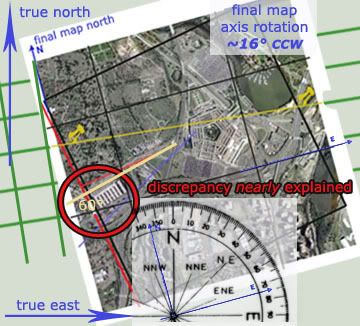
We’ve already seen the animation’s general gridlines can have no relation to real geography, but this shows the overlay map is also rotated even from the program’s own internal geography The discrepancy is not what I was hoping to see but it’s noteworthy, looking like about 7° counterclockwise. Below is a synthesis with the animation grid (in green, at proper angle but not to scale) app 9 deg ccw relative to true north and east – my final map graphic over that with tacks lined up - app 9 deg ccw + app 7 deg CCW = the final map rotated approximately ~16° CCW – from true orientation.

This double rotation, again, based on fairly accurate but imprecise analysis – seems to explain about 4/5 of the difference between the recorded heading and the onscreen ground track north of the Navy Annex and Citgo. The true official heading of 60° relative to true north is slapped on compared to the red line representing the animation path. With 80% of this explained from two different rotations, I’m left wondering if there is another twist in the data somewhere or, more likely, if I simply had enough imprecision in my graphics to throw in this large margin. That was entirely too much work for only 4/5 of an answer, but too late now.
---
update 3/31/08:
My margin just improved. Originally I worked off the FDR mag heading of 70°, a visually-mapped animation approach of 90° mag/80° real, and an animation grid rotation of ~9° CCW.
However a more exact animation approach is more like 79° real (at least one guess puts it at 76°)
FDR ground track true, more accurate than magnetic, reads 61.2°
Animation grid rotation: likely 10.08° CCW (magnetic as real north)
Final map rotation relative to global grid: still ~7° CCW
Total final map rotation from reality ~17.08° CCW
animation app. heading - established rotation = FDR heading?
79°-17.08° = 61.92°
This matches the FDR ground track true 61.2° with a margin of error I’ll call 0.72°. Not bad for an incoherent janitor, huh?
---
At any rate, I think it’s clear that both the animation lat-long grid is rotated well to counter-clockwise, and the terminal map yet further CCW from that –these two “errors” seem to be the primary reasons for the seen north path and hopefully any doubt that the map has been rotated relative to the data have been put to rest.
Conclusion: Data Set Dead
The significance of this for some cannot be ignored; as far as I can see, this double-rotation is the only thing that can be said to constitute “NTSB northern plot data” as promoted by Pilots for 9/11 Truth. It is by this “data” that other FDR evidence showing a 70(ish) magnetic heading was deemed “altered” to fit the official path marked by faked pole damage, etc. In February, Pilots co-founder and head honcho Rob Balsamo posted an e-mail exchange with “a mathmatics and statics expert in reverse engineering data.” This guy, John Farmer, explained:
“I posted a little analysis I did based on the FDR data and it suggests that my hypothetical was indeed what was done to the data. I’ve demonstrated it to my satisfaction and I’ll leave the rest in your capable hands. My guess is the simulation was done before the data alteration (that is why in the video it flies north of the Citgo station). To be honest, they really did do a sloppy job in the alteration and I would expect better from our civil servants. The guy who did the work should be fired for not doing a sanity check before releasing it.” [alternate posting not requiring a registration to read]
Rob had Farmer affirm for clarity that “the .csv file was altered in heading to match the south flight path.” Others have followed suit before and after this, since the FDR and first “Citgo witness” entered the discussion around September 2006. Aldo “Merc” Marquis, CIT co-founder and proponent of Witness/FDR northiness, said in March “I don't believe [the data] came from the Northside flyover military plane that the witnesses saw. I believe the data is faked to try and match the Northside Citgo path somewhat, for whatever reasons they chose. Either way, we win.”
Anyway, I wasn’t sure if Blsamo had wised up after people had started presuming simple rotation - so I e-mailed him the other day to clarify:
---
“Your animation includes a “transition to southern data” and the page explains you removed “NTSB northern plot data as a variable.” Before I go off on another misunderstanding then, what does the northern plot data consist of? Even after the hullabaloo I created with my stuff about the animation's map rotation being the only thing indicating this, I still have heard nothing to the contrary. I figure if there's something else in the data indicating a 80-degree-ish real trajectory at the end, you'd know and I'd like to before going to press."
---
His response was typical unapologetic Pilots boilerplate: “the map isnt rotated. We are not sure exactly how the NTSB made their plot as they are refusing to answer any questions. […] The grid on the ground correspond to lat/long lines in terms of true north and are accurate at the runway and at the pentagon/map in terms of angles/parallels. The only thing that doesnt correspond is the heading in the heading indicator at end of flight in which John Farmer did a great job locating the alterations.”
---
This is ass backwards. The grid is off in every way from real lines, the map is rotated, the NTSB clearly "plotted" their "data" with this rotation, and about the only true thing about the last moments that matches the actual data is the heading dial. He hasn’t backed down, and it seems there is no interim finding at P49T – every last crooked line is etched in stone forever.
As Russell Pickering summed up in March, “the final conclusion of PFT is obviously that the FDR data showed the south path or they would not even claim it had been altered. They had to claim it was altered since the actual aircraft data shows it on the mechanical damage path.” Oh, 1.2 degrees off they’re saying now. Whatever. There is no north plot data, and the people who promote such, to paraphrase Farmer, "should be fired for not doing a sanity check before releasing it.”
---
Update: Regarding confusion about what exactly the Pilots have argued re: north plot data and map rotation, see this post.


No comments:
Post a Comment