Showing posts with label NTSB animation. Show all posts

Tuesday, April 22, 2008

ANOTHER LAGASSE/THE SECOND GENERATION

LAGASSE AND EASTMAN PART III
ANOTHER LAGASSE/THE SECOND GENERATION
Adam Larson / Caustic Logic
The Frustrating Fraud
April 23 2008
edits - 4/24 4am


Pentagon Paradigm Shifts
Following the delirious euphoria of no-757-impact certainty in much of the 9/11 Truth movement, there was a strong backlash in 2005 and after as Hoffman, Pickering, Desmoulins, Rivero, Sferios, Salter, etc. tackled the evidence at the Pentagon and found the prevailing meme sorely lacking. Debunkers from outside the movement made gains as well on all fronts, especially regarding the Pentagon issues, made as they were almost exclusively of straw. In general people started noticing the size and consistency of the eyewitness record and of the impact hole. It was looking bad for the anything-but-a-757 meme passed of from Meyssan to Pentagon Strike and 911 In Plane Site and all over the Internet.

Dick Eastman and his Zionist-engineered south-path-killer-jet-with-weaponized-air- vortices insanity, and its north-path-decoy-flyover, as covered in part 1, was among those looking staler every day. as seen in part 2, his star witness Sgt. Willaim Lagasse was at the time the only witness who clearly described the airliner as passing north of him at the Citgo station, ruling out all the impact damage, which happened on a different path (taken by the F-16 killer jet). So Lagasse had rescued Eastman’s theory with his testimony in mid-2003 (accidentally it would seem), but as Eastman faded into obscurity, Lagasse too saw his moment in the spotlight pass. By early 2006, no one much cared what side of the Citgo the 'decoy' plane flew on, but the idea was out there, floating around among those who wondered what really happened at the Pentagon.

The Louder Than Words guys (Dylan Avery, Korey Rowe, and Jason Bermas) were among those who seem to have missed the no-757-is-bs memo. In their massively successful 2005 Loose Change second edition, they showed how the light poles ‘just popped out of the ground’ undamaged, spoke of a single JT8D engine found inside a single 16-foot hole, and speculated that a cruise missile had hit the Pentagon. They also started their own Loose Change discussion forum in February 2006, to which several aspiring researchers signed on in its early months, impressed by the sudden high profile of the video and hoping to add to future editions.

Among those who signed up were Aldo Marquis (as Merc) in April, and Craig Ranke (as Lyte Trip) in June, two cats from Southern California who would later of course form Citizen Investigation Team. Russell Pickering of PentagonReasearch.com, a Seattle native, also joined in May under his own name, and shared his knowledge of the evidence, which had been leading him to posit the impact of a remote-controlled 757. As Pickering proceeded with reconciling his ‘mechanical damage path’ and witness analysis, Lyte and Merc held out against this trend with their own research showing again no such crash was possible. All three impressed the LTW guys into the summer, with Pickering being made a moderator and Merc proposing a brilliant plan.

A Gem From Arlington
According to Merc, it was he who first suggested, some time in the summer, a research trip to the Pentagon to gather clues about this increasingly contentious aspect. Avery and his partners agreed it was a good idea, and all three decided to go along, and decided to bring Pickering in as well to form a six-man “elite Pentagon research team.” The team sprang into action and, aside from Merc and Lyte, assembled in Arlington on Monday, August 21. On Tuesday morning, Pickering was at the Citgo making first contact there as Marquis and Ranke arrived. Ranke later summarized “This turned out to be very good because he established contacts making it easier for us to return and talk with people there later.”
L-R: Bermas, Rowe, Avery, Pickering, Marquis. Photo by Craig Ranke (app), Arlington VA August 22 2006 word balloons by Marquis, a mood clearly communicated by his pose for the camera here.

The team's few days there were filled with witness interviews, area photography, meetings with various bureaucrats, and a wee bit of partying at night. On Thursday afternoon Merc and Lyte caught their plane back to California, but not before first visiting the pivotal Citgo station with the full team. They filmed the area until they were briefly detained and had most of their photos/video deleted. As I understand it was this same day that, as Merc later summarized:

“We talk to the manager of the Citgo station in person in 2006 and she tells us about her employee Robert Turcios who saw the plane. SHE told us that Robert saw the plane on the north side and that this has always been his story. We instantly thought about Lagasse's email to Dick Eastman and red flags went off like crazy.” [source]

These were the good kind of red flags, of course, the kind you charge at. And he had Eastman and Lagasse to thank for the insight to know the value of this gem freely offered by that manager of a military facility. As he explained to me on the phone, “the only thing that ever gave me a clue to the north side approach was Lagasse’s account through Dick Eastman. When we went there […] it wasn’t like we were looking for any – or being led to any specific witnesses,” [3:30] but admits “Lagasse and the north side were in the back of my mind during that entire first trip,” and especially right after they were led to a specific witness that reminded him of that. [source – 3:30 and 4:50]

Shift Change - August 25 2006
Across the country in Washington State, that distant guru was apparently unaware that his findings were setting off alarms as they met, in Merc’s mind, with the elusive corroboration Eastman himself never received. In fact, it was a different mood entirely in Yakima, and it would seem old Dick had reached the end of his decoy flyover rope. At 3pm on August 25 he wrote on the subject of [frameup] “I am wrong about Flight 77 Pentagon. Outstanding video simulation of attack on the Pentagon using Boeing 757,” he noted, too weary to even type complete sentences. [source]

He was referring to Mike Wilson and Integrated Consultants’ computer generated 3-D animation showing how the impact likely happened. This accurate but imprecise recreation, posted in video form at Youtube back in late June, “shows poles, smoke trail” in a convincing enough manner that Eastman was forced to surrender; “I now believe that a Boeing 757 hit the Pentagon - that this explanation best fits the data. Please pass this around - I don't want to hold up the search for truth any more than I already have.” [source]

I thank JP Desmoulins for alerting me to this truly odd memorandum, which seems to roughly mark the end point of his tracking of Eastman and Lagasse. Reading of his unexpected surrender, I suspected sarcasm at first; nothing from the laws of physics, of logic, of any evidence, had altered his course before. But his language is quite clear – he asks the movement to continue without him. Note also how he says “I am wrong,” not ‘was wrong.' He was still there, just stripped down by the persistence of the debunkers, but until whenever, Eastman had announced his resignation from the case, at 3pm on August 25, news he had asked his readers to spread. Two interlocked theories, the F-16 impact one and the north-path airliner flyover one, lost a champion that evening. But it would seem it gets darkest before dawn, and just then, a whole lot happened at once to revive one of those, if not the other.

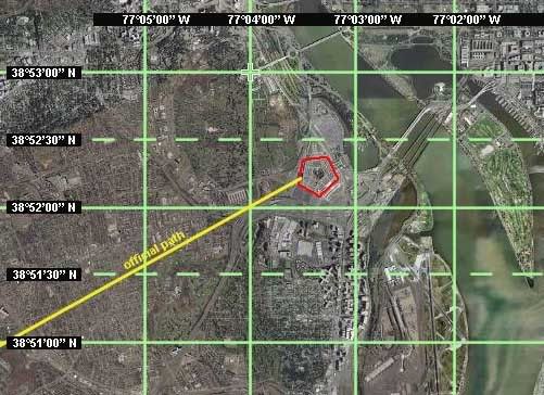
At the very moment Eastman hit the submit button on his resignation, the next generation of north-path flyover champions were typing up their proposal to replace him. There is no evidence Eastman followed these developments, or that he didn’t, but having returned to the west coast the previous evening, Merc was typing up his notes. Just two hours after Eastman’s pessimistic plea, he posted the first report on their findings at the LCF, entitled “There Was A Plane!” “Hey guys, I'm back and have some interesting news for you all. THERE WAS A LARGE PLANE SEEN DIVING TOWARDS THE PENTAGON! We have interviewed several eyewitnesses who saw it.” Does this mean he too had seen the light and was now promoting a 757 impact? Hardly. He offered a brief synopsis of their general witness findings, to be elaborated later, and closed with this more mysterious revelation regarding the pivotal Citgo gas station the official path passed south/east of (read 'west' here as 'north'):

“The Citgo manager said her employee places the plane on the OTHER SIDE of the Citgo, the left side or west side (blue line), she is "90% sure", there is a follow-up due on this... So spread the word. There was a plane at least as far back as the Sheraton, Navy Annex, and Citgo gas (WRONG SIDE!!) Flyover anyone? [emoticon – waving a white flag] There is more to come! Stay tuned.”
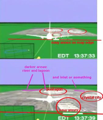
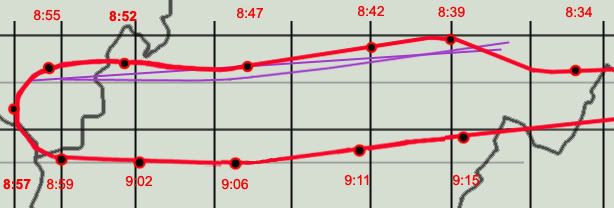
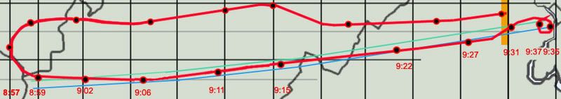
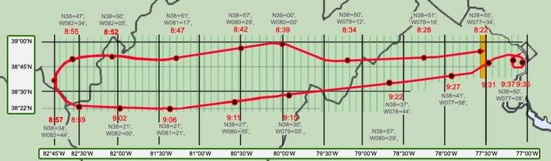
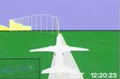
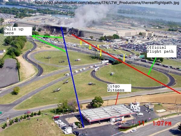
Above is the graphic that had its first airing as describing the yet-unnamed witness' account. And THIS in turn tied in with the NTSB’s own animation, just posted at Youtube on the 24th by Pilots For 9/11 Truth, which of course also showed the plane flying almost where Eastman, Lagasse, and now this employee had placed it, as well as too high to hit anything relevant. A major shitstorm was set to blow in within a remarkably short time, and more than any other moment, the evening of August 25th marks both the terminus of the old north-path insanity and the birth of the new, with curiously precise timing suggesting a shift change at a gas station.

Chess Moves Around CIT’s Lagasse
Indeed there was more to come, with two different words on the same subject being spread through the night and following weeks. As Eastman receded, reports came in from Pickering and Lyte Trip on the removed cameras, their tour of the Virginia Dept. of Transportation, more interview details (Walter, England, Zackem, McGraw, Paik, Pugh, etc.), and lively discussion of the implications. All parties agreed there was a large silver or white airliner in the evidence and no missile or killer F-16. But from there they disagreed; Lyte posted a pivotal thread on September 9 titled “We've Narrowed It Down To 2 Possible Scenarios... Impact or Fly-over?

The next day the bomb was dropped by his partner declaring which one made more sense; Merc titled the thread “Citgo Witness I Spoke W/ Breaks The Case Wide Open, Flyover?” The announcement was big news at the LCF, perhaps a cause, and definitely a beneficiary, of the mass of users online the next day, (1,225 at 3:27 pm, a forum record), to mark the five year anniversary of the attacks.

In the published details of phone discussions with this still-unnamed employee, conducted on the 5th and after, we can see glimpses of a highly curious account; aside from the north path testimony, he also described the plane as gray and very unlike an American Airlines style, and he was the first to report any kind of pull-up of the plane, which for once directly indicated a possible fly-over. This added to his obvious value to the scenario in the ‘back’ of Merc’s mind, but not apparently enough at once to trip his overkill sensors.

They would not get to keep this witness without a fight. Just five days later, on September 15, Judicial Watch released to the public the Citgo station security video, obtained through lawsuits, and with no forewarning. Avery chimed in “I'd hate to say we caused any part of this, but our team sure caused a stir at the gas station....” Merc added immediately “I'd hate to say it had anything to do with our star witness, but what timing.” Pickering took a look at the multiplexed video and decided the only person that could be Turcios can be seen running into the store after the impact, contrary to his story given to Merc (this was quite a while before John Farmer or myself decided the same). Naturally, a massive fight ensued. On October 5 Merc said “the Citgo video was released SPECIFICALLY because of the Citgo witness and his account. I no longer believe this as a possibility, but as an unfortunate reality. A counter chess move if you will.”

The video must be altered, CIT has argued in defense of their witness, and Pickering’s work was said to have proven this, even though he denied it. Eventually this debate expanded to the point where Pickering asked Merc to clarify some hints: “do you believe I am a government agent and was involved in the alteration and release of the Citgo video to sabotage your work? Yes or no?" Merc responded quite reasonably “your behavior and actions indicate to me this is a possibility. But I do not know for sure one way or the other," hoping to cast some blanket doubt over his fellow researcher whose ability to communicate the truth threatened their endeavor.

Things had clearly devolved among the elite research team, and opinions differed strongly whether it was Russel’s stubborn and “deceptive” adherence to “the official story” that was to blame, or the absurd beliefs, belligerent antics and tactical accusations coming from the other side. As the LTW core guys worked out their anticipated Loose Change Final Cut on into 2007, they seemed to favor Pickering’s even hand while repeatedly banning and re-admitting Merc and Lyte. Much bitterness prevailed and harsh words were exchanged. Pickering later professed his pleasure with the final cut of Loose Change, once it was released in late 2007, while CIT had to comfort themselves with bit parts and being listed in the credits as in the “Arlington Crew.”

Not ones to keep all their eggs in one basket, by that time the duo had pursued their own avenue, which transformed them into the hard truth warriors known as Citizen Investigation Team. Their calling took them back to Arlingon, back to the Citgo, to their Lagasse and of course to Eastman’s original, and even further. They would “irrefutably” establish the flight path of the plane people saw with no reference at all to any mechanical damage or any other clue that the plane actually hit anything but air. As for the physical evidence, this would still be 'the crime,' but all faked by… some… means. Doesn’t matter. A “military deception” would soon be ‘100% proven’ by CIT and Sgt. Lagasse would, again, help unquestioningly establish it [no, that wasn't a typo].

Friday, April 11, 2008

A CHERRY PIE FROM ROB’S ORCHARD

A CHERRY PIE FROM ROB’S ORCHARD
Adam Larson / Caustic Logic
The Frustrating Fraud
April 10 2008
last updates 4/16


Picking?
My recent Youtube video That Darn NTSB cartoon, part 1, featured Rob Balsamo/Johndoex vocally promoting north path ‘data’ supposedly from Flight 77’s black box and ‘corroborated by Pentagon police officers…” I was explaining the issue and working up to a video explaining my previous findings that the ‘north plot data’ was just an illusion created by turning the final map the wrong way, which I had always taken him as denying. Balsamo left a comment: ”lol... this has to be the worst case of cherry picking i have ever seen. Bravo CL, you have out done yourself.”

I responded “if I'm picking cherries that implies I'm ignoring things. Regarding my analysis of the FDR north path, using YOUR OWN words, what am I ignoring? The actual 'north plot data?' Or what?” His explanation was interesting, “CL, we have been saying the "map may be rotated" since Aug 2006.” I didn’t recall that ever seeing them say anything like that, but spurred by this comment, I did look around a bit and am left asking “Cherry picking? What else should a cherry-hungering blogger do when he finds himself in a friggin’ cherry orchard? Dig around for a raspberry bush?”

Did he or some other member say once, somewhere, the "map may be rotated"? Probably so since he put it in quotes and gave it a date, and they say a lot of things – the question is how, when, where, how often? Is this the impression that comes through? Where can I read/hear these thoughts? “Clearly you don’t remember when I told you the same thing during our first exchange,” he tipped me off. I did miss this first time around, and going back to the passages he likely means here, from my thread at Above Top Secret.com, I see why. I’ll cover this at the end; first the cherries. This is not a perfect sampling by a long-shot, but I have enough cherries for a whole pie. I have less fresh ones than fermented vintage from his earlier activist phase before he was banned everywhere. I was made more familiar along the way with his well-known tactics of appeal to expertise, to their impressive roster, distractions and insults, pretending his opponents are all stupid and lazy, lengthy irrelevant re-posts and links, links, links… Clearly he enjoys being banned, and values true discussion roughly nil.

The Issue: Headings and Rotations
First, to understand the significance of any of this, one must understand somewhat the heading/map issue. The simplest way to explain this is with this on-screen discrepancy – the heading dial (lower right) reads 70, meaning degrees from the magnetic pole, which corresponds with the FDR-recorded heading. Considering magnetic declination in the area at that time of 10.08° this means a path about 60° from the true north pole, which closely matches the physical damage path before and into the Pentagon. To end at impact, a line on this heading would have to pass south of the Navy Annex and Citgo gas station, where the light poles were severed. The path that we see on the screen however passes well north of the Annex, the Citgo, and the poles, on a heading relative to landmarks that has been multiple-verified by everyone as about 78-80° real, so 88-90° magnetic. So in the picture above, the heading dial and the visual path do not match; one of them must be wrong. [more info here] Either the ground map is rotated wrong while the plane’s movements are accurate to the data, or the ground clues are accurate to the data with the heading dial and all other data altered to cover this up.

Considering the first option matches the rest of the more raw data, nearly matches the physical damage path (for heading) and as I’ve shown is visually verifiable as being the case to anyone who takes the time, the answer is clear.

The alternative - they altered the data to fool us but forgot to alter one rendering of it – the cartoon, the only version most people could see an understand - is of course worth considering but seems a bit silly. That would be like writing a screenplay, filming the movie, deciding you don’t want people seeing it, re-writing the screenplay, then sending the new screenplay out to theaters while slipping in the original movie that was never re-done. Ready to launch a fledgling Truth group to stardom…

The Orchard
I stand accused of distorting Rob’s claims to make him out as unquestioningly supporting the second hypothesis when, in fact, he’s always remained open-minded on the rotation issue. This is what I found, in chronological order except two dates covered at the end. Remember we're mostly discussing the screen here, the visual animated path and the heading dial. Which has he cast more doubt on?

8/24/06, on first posting of the animation’s final maneuver, “About This Video This is the final maneuver performed by the aircraft which hit the Pentagon on September 11, 2001. This animation was provided by the NTSB and is accurate in terms of the flight data recorder on board this aircraft.” No mention or notice yet of the north path aspect which, other than location of the final map, is all that really conflicts. The altitude is about right, which was his point. [source]
11/28/06, Democratic Underground: “When we first received the animation, i had thought perhaps the NTSB messed up on the graphical presentation as well (we went over this briefly on today's Jack Blood broadcast). However, if you look at the initial phases of flight (particularly the take off), it is lined up perfectly with the taxiways and runway as the aircraft taxi's out for take off. Also, we have further evidence which confirms the flight path.. including witnesses, which will be put together in a report. […] The facts conflict with the official fairy tale. […] the professionals at the NTSB dont make mistakes in terms of magnetic variation (as shown in the initial phases of flight).” [source]
3/27/07 at the Loose Change Forum: “Heading indicator altered to match southern approach... however plot confirms North of Citgo testimony given by Pentagon Police Officers. (Please try not to delete this if you want truth)” [source]
5/9/07 – Micheal Herzog interview, RBN “the NTSB data, the plot, the animation that they plot out, has it on the north side of that Citgo gas station […] The north path that we’ve been trying to get answers for, from the NTSB and FBI, is also corroborated by Pentagon police officers, filmed on location, betting their life on it that it was on that side of the gas station. […] [The PentaCon] corroborates the flight data recorder as far as the flight path being north… I mean, right there, it’s dead to rights, right there that the investigation needs to be opened.”
6/4/07 – first comments at ATS, special treatment below: “The heading (in the little instrument) was altered, to confuse the average layman and to grab suckers to buy the official story and the fact the professionals at the NTSB 'screwed up' in their plot.”
6/7/07: “Fact - The NTSB plotted the aircraft north of the govt story flight path” [source]
6/8/07 more at ATS.com, as with 6/4, see below: he mentions that at one point, “i had thought the NTSB may have screwed up a bit and rotated the map a bit.
7/31/07 e-mail: “Im not trying to sound derrogotory here, but do you happen to have a learning disorder? […] as a side note, the map isnt rotated, and the heading in the csv file does not line up with the physical damage.”
8/3/07 e-mail: Q: You're sure the final map isn't rotated relative to the background lines? A: “Put Google Earth into the same perspective as NTSB animation map with grid lines (you satisfied yet that the animation is from the NTSB? lol), lat/long on ground. You will see very little difference in angles.” [wrong - the difference is exactly that seen between the animation path and heading dial - about 17 degrees]
[ahem...]
9/19/07, e-mail: “The map isnt rotated. We are not sure exactly how the NTSB made their plot as they are refusing to answer any questions. […] The only thing that doesnt correspond is the heading in the heading indicator at end of flight in which John Farmer did a great job locating the alterations.” [note: Farmer no longer holds this view (it was a 'first guess') and thinks johndoex is a kook - my words, not his].
9/24/07, Above Top Secret: "I'll let you in on a little secret. It doesnt matter if the map is rotated or not. We are not arguing that fact in the latest 3D animation. [...] The map rotation just isnt that important, especially since we place the aircraft on 61.2 degrees and it still doesnt account for physical damage." [source]
4/?/08: “CL, we have been saying the "map may be rotated" since Aug 2006.”

initial doubts
As the two bolded examples show, johndoex had indeed, at one time, been wiling to entertain the obvious and proven conclusion. As the rest of the text above shows, he quickly stopped believing in it for some reason. As I started my thread at Above Top Secret.com alerting people, clumsily I confess, to the discrepancy that challenged the north path 'data' in late May 2007, Rob weighed in on June 4. I hadn't yet decided the map was rotated, but that was seeming the most likely.

“Havent read this thread... but heres a reply from P4T Co-Founder.” He linked to where he had just explained elsewhere “the headings in the csv file and animation were altered... The NTSB plotted the animation from take off on runway 30 at Dulles to end of recording based on lat/long (see the grid on the ground? See the yellow poles extending from the aircraft to the ground? Yeah.. thats a plot). The heading (in the little instrument) was altered, to confuse the average layman and to grab suckers to buy the official story and the fact the professionals at the NTSB 'screwed up' in their plot.” In other words, the final animation map is the ONLY real clue to heading, not nan error, and so all other data from the dial to the FDR decodes that show the same, were altered. He also summarized “the animation heading (instrument reading) was altered to show a southern approach. If the heading wasnt altered it would show 090 Mag or 080 True. Just as the plot shows to the north of Citgo.”

A few days later on the 8th, he posted for us all a rundown of his thinking on the flight path discrepancy, “in a nut shell, the timeline, files, how they were obtained. the making of small video clips on youtube.. the introduction and reasons why to start questioning the flight path instead of thinking it was an error.. and the making of our film.” They started by deciding the animations truly was NTSB, despite no paper trail, because it matched the other data they put out. After this, they quickly noticed that it didn’t match, which is what made this proven NTSB product so interesting of course.

“We noticed the flight path right away that it was off in the animation. We didnt pursue it initially because i had thought the NTSB may have screwed up a bit and rotated the map a bit. So we proceeded with altitude and the like... remember.. its late august 2006. Then i made a video regarding the final maneuver and lack of intercept... you probably seen it.. many have. .Dated Aug 24, 2006. (note, we arent even worried about the flight path at this point because we think the map is rotated) […] meanwhile.. Craig and Aldo were working on their research. .went to DC.. etc. They came back and said "We have a witness who places the plane North of the Citgo!".. And i said.. well great.. now the flight path goes into the rest of the conflicts with official story.. and a new video was born...”

So that's it. It looked like an error, but some external ‘witnesses’ and all they have to do with data translation issues shifted the analysis of the FDR. Gov't-supplied witnesses that match something that’s likely an error in gov’t-supplied data should raise red flags. Rob sees a red flag and charges. Now the video screen is real and all reality rotated around it. Rob, I’m sure you’ll see this sooner or later; feel free to show me your more reasonable side in action. I'm not listening to any more interviews or registering for your forum just to fish for quotes. But this sampling here don’t look too good. You tacitly and indirectly admit now that the map is probably just rotated, and point out that you suspected that at first. So what went wrong in between? Hm?
---
updates:
4/12: I forgot to include this line from his comments on my video page:
"Yes, later i had made the statement that the "map is not rotated" via email which you promptly posted on your blog, despite the numerous interviews i have done to the contrary. Think about that.. :-)"
Yeah, I started thinking about that and that's how this post came to be. Mr. Hyde, please quit telling me you're also some reasonable Dr. Jekyl, somewhere, in the interview I can't find, when you've been running around saying shit like that posted above.

4/16: New quote, e-mail Rob sent out a while back to someone else and saw fit to share with me:
"Map rotation is pretty much what we been saying since day 1 and have said on almost every radio and TV interview. We thought the map was rotated when we first got the animation, that is why we worked on [other issues...] The flight path is secondary and [...] the other issues are primary. [...] We did briefly look into the rotation [...] which it appeared the map was not rotated, and eventually were going to look into it more thoroughly. But since CIT has found new witnesses to a DRA (Down The River) approach, i dont think we are going to bother much more with the flight path and leave that up to the people who were there and actually saw it.

[...] we later included the flight path in our "Questions to the US Govt" on our pentagon page because there are many independent north side witnesses (we wouldnt have even bothered with the flight path had there not been any NOC witnesses).

The professionals at the NTSB just dont "rotate" maps by mistake. They do these types of animations on a regular basis. Since there are so many NOC witnesses, perhaps someone (a whistleblower?) at the NTSB rotated the map intentionally to get people looking into a north of citgo approach? Who knows...."
[emph mine - I tend to agree, which is part of why I'm looking into this][source]
The witness-proven east of the river bs thing is not proven at all but what Balsamo is saying here is ALL the FDR data is out the window now - an obvious fake since it doesn't match the witnesses. (who essentially don't exist - one odd, vague guy and some misread other evidence, etc...).

So it was rotated, and probably not on accident. Rob and I seem to be agreeing on this. A backwards mag rotation might make sense, but man what sloppy work. But seven degrees? The JREFfer types will have to think of their own explanations. Step two... hmmm.

Monday, September 24, 2007

NTSB ANIMATION INTERNAL GEOGRAPHY {masterlist}

NTSB ANIMATION INTERNAL GEOGRAPHY {masterlist}
Adam Larson / Caustic Logic
The Frustrating Fraud
Sept. 1 2007


This is to organize the few posts in which I have explored the internal geography - the scale and orientation of the grid beneath the plane, what seem to be latitude or longitude markers. It's not the most relevant line of inquiry, but I got interested and my analysis finalized, it's worth what it's worth.

As I started out, right off the runway I see an oddity: "the Elastic runway." (July 31) This one was pretty dumb. I let it drop as an illusion, but it is the first glimpse of the grid rotation that started popping up as I dug in.

PART 1: Ground Objects: Looking at the placement of origin (Dulles) and end (Pentagon) in relation to real-world latitude and longitude lines.

PART 2: Longitude Lines

PART 3:Grid Clues: Orienation and proportion. (August 21) Itseems square and titled as if to magnetic north.

PART 4: Latitude Color Track (with video!)

PART 5: A turn for the worse: The culmination of my mapping work here: the north-of-the-Citgo flight path from the NTSB animation is shown once and for all to be the result of rotation from the real data and no more, and all those who've promoted it as evidence are shown to be fools.

Friday, September 21, 2007

NTSB ANIMATION INTERNAL GEOGRAPHY PART 5

NTSB ANIMATION INTERNAL GEOGRAPHY PART 5
THE FINAL MAP: A TURN FOR THE WORSE
Adam Larson / Caustic Logic
The Frustrating Fraud
Finished Sept. 21 2007
updated 5/26/08


Very interesting thread at Above Top Secret when I posted this.

The Final Grid Analysis:
In my previous studies of the global grid beneath Flight 77 in the NTSB’s animation, I had found that the grid does not conform to real-world lines in proportion, scale, or orientation. I’m not 100% sure on the exactitudes of the final take seen below, but by multiple points of evidence it’s the best fit with what I was consistently seeing.
This is based on extensive tracking of 11 east-west-ish “latitude” lines at multiple points in the animated flight as it crossed I think 68 apparent longitude lines. The official path shown here in red is oriented to true north, in agreement with maneuvers and time in the animation, and verified at multiple points as consistent with lat/log data from the csv file. So the red is pretty solid beyond minor variations in my graphics. The less-than-level grid seen here is also not quite straight. Straight lines just weren’t cutting it to explain all intersection points I noted, so I used slightly bowed horizontal lines. Whether or not this makes sense, the exact slant changes little over a 300-mile span; oriented about 6° CCW at the south turn (left-hand side) and ~9° CCW from due east around the Pentagon on the right.

If the curve freaks you out, let’s presume straight parallel lines, but rotated in the neighborhood of 5-10° counterclockwise from real-world latitude lines. In fact, it’s at the high-altitude south turn end that I’m least sure, and lower altitudes at takeoff and near the end make readings there more precise. So if the lines are straight, they are in the upper range, no less than 8 degrees. The overall rotation looks close to magnetic declination, which I’ve established as 10.08° counter-clockwise at that time and location. This indicates that perhaps I read some crossings wrong enough that I’m off by a few degrees and the grid was rendered with magnetic north used as north. It doesn't sound very sophisticated for the National Transportation Safety Board, but something has got these lines off-kilter.

Anyway, we now have two different orientations to consider when looking at the animation flight path – the on-screen global grid relative to true geographic heading. So let’s throw in a third level that comes into play in the animation’s final seconds and the question that got me interested in this to begin with.

The Overlay Map: Tacked-On Straight?
This started from my investigation (independently and sloppily replicating the previous works of others) of the north-path aspect of the (working copy) NTSB animation. This of course shows a final approach north of the Navy Annex and Citgo station, ruling out the physical damage path and prepping mind’s eyes to accept the PentaCon witnesses just then emerging. The animated craft is shown headed towards impact on a heading of roughly 80 degrees real relative to the ground (90 magnetic), and yet the FDR data and the heading dial on the animation itself shows a magnetic heading of 70.0, consistent with the 60° official path.

The best guess I’ve seen around is that this overlay map was simply rotated the wrong way.
For example, JREF member Apathoid, with slightly different numbers than I have, decided “the animation flight path was off 21 degrees. Since magnetic variation in the area is 10.5 degrees, its safe to assume that, in the working copy given to PfT, the NTSB simply rotated the floor map the wrong direction.”

Adding my grid findings to the picture, it seems possible that a NTSB techie was told the grid lines were set to magnetic (actually about 10.1 degrees) and be sure to rotate the map to be accurate – so they did but turned it the wrong way. An even 20-20 split makes the most sense, which makes it tempting to call my grid rotation just off enough to account for ten degrees of this, and to seek the other ten in a rotation of the map counterclockwise from these.

Here are three screen captures from the final moments that show the approaching overlay, allowing us a glimpse of a single latitude line that, thankfully, actually crosses the map. I marked its intersection with the edges with tacks, and drew the yellow lines across the map to trace the parallel across. Note that the line crosses Pentagon’s northern third, which as I’ve shown elsewhere real-world lines do not.


To analyze the content of the overlay map itself, I decided on the rough boundaries of it by analyzing the west (forward ) edge as the plane approached. I anchored this on the angle formed relative to the Navy Annex and the rough percentage of the map edge width it occupies. The back edge, and thus the scale of the map, is harder to read precisely, especially at this resolution. But I think it’s good enough; darker spots behind and to the left of the Pentagon seem to correspond to their lagoon and/or the Potomac, and some other dark shape is visible cutting the opposite corner.

I mapped real latitude and longitude lines onto a Pentagon map rotated 90° counterclockwise to mimic the approach from the west. The red map edge is placed relative to the Navy Annex to delineate the west edge. The bold black square at an offset angle thus marks my proposal for boundaries of the overlay map - I presumed a square, which looks about right and gives us the waterline spots responsible for the dark patches. Note the placement of the Pentagon and the Crystal City buildup on the right for further comparison. This is of course imprecise, but enough to get us in the neighborhood, and we can see that the yellow line is not parallel to the mapped latitude lines, meaning that the overlay map is rotated.

We’ve already seen the animation’s general gridlines can have no relation to real geography, but this shows the overlay map is also rotated even from the program’s own internal geography The discrepancy is not what I was hoping to see but it’s noteworthy, looking like about 7° counterclockwise. Below is a synthesis with the animation grid (in green, at proper angle but not to scale) app 9 deg ccw relative to true north and east – my final map graphic over that with tacks lined up - app 9 deg ccw + app 7 deg CCW = the final map rotated approximately ~16° CCW – from true orientation.

This double rotation, again, based on fairly accurate but imprecise analysis – seems to explain about 4/5 of the difference between the recorded heading and the onscreen ground track north of the Navy Annex and Citgo. The true official heading of 60° relative to true north is slapped on compared to the red line representing the animation path. With 80% of this explained from two different rotations, I’m left wondering if there is another twist in the data somewhere or, more likely, if I simply had enough imprecision in my graphics to throw in this large margin. That was entirely too much work for only 4/5 of an answer, but too late now.

---
update 3/31/08:
My margin just improved. Originally I worked off the FDR mag heading of 70°, a visually-mapped animation approach of 90° mag/80° real, and an animation grid rotation of ~9° CCW.
However a more exact animation approach is more like 79° real (at least one guess puts it at 76°)
FDR ground track true, more accurate than magnetic, reads 61.2°
Animation grid rotation: likely 10.08° CCW (magnetic as real north)
Final map rotation relative to global grid: still ~7° CCW
Total final map rotation from reality ~17.08° CCW
animation app. heading - established rotation = FDR heading?
79°-17.08° = 61.92°
This matches the FDR ground track true 61.2° with a margin of error I’ll call 0.72°. Not bad for an incoherent janitor, huh?
---
At any rate, I think it’s clear that both the animation lat-long grid is rotated well to counter-clockwise, and the terminal map yet further CCW from that –these two “errors” seem to be the primary reasons for the seen north path and hopefully any doubt that the map has been rotated relative to the data have been put to rest.

Conclusion: Data Set Dead
The significance of this for some cannot be ignored; as far as I can see, this double-rotation is the only thing that can be said to constitute “NTSB northern plot data” as promoted by Pilots for 9/11 Truth. It is by this “data” that other FDR evidence showing a 70(ish) magnetic heading was deemed “altered” to fit the official path marked by faked pole damage, etc. In February, Pilots co-founder and head honcho Rob Balsamo posted an e-mail exchange with “a mathmatics and statics expert in reverse engineering data.” This guy, John Farmer, explained:

“I posted a little analysis I did based on the FDR data and it suggests that my hypothetical was indeed what was done to the data. I’ve demonstrated it to my satisfaction and I’ll leave the rest in your capable hands. My guess is the simulation was done before the data alteration (that is why in the video it flies north of the Citgo station). To be honest, they really did do a sloppy job in the alteration and I would expect better from our civil servants. The guy who did the work should be fired for not doing a sanity check before releasing it.” [alternate posting not requiring a registration to read]

Rob had Farmer affirm for clarity that “the .csv file was altered in heading to match the south flight path.” Others have followed suit before and after this, since the FDR and first “Citgo witness” entered the discussion around September 2006. Aldo “Merc” Marquis, CIT co-founder and proponent of Witness/FDR northiness, said in March “I don't believe [the data] came from the Northside flyover military plane that the witnesses saw. I believe the data is faked to try and match the Northside Citgo path somewhat, for whatever reasons they chose. Either way, we win.”

Anyway, I wasn’t sure if Blsamo had wised up after people had started presuming simple rotation - so I e-mailed him the other day to clarify:
---
“Your animation includes a “transition to southern data” and the page explains you removed “NTSB northern plot data as a variable.” Before I go off on another misunderstanding then, what does the northern plot data consist of? Even after the hullabaloo I created with my stuff about the animation's map rotation being the only thing indicating this, I still have heard nothing to the contrary. I figure if there's something else in the data indicating a 80-degree-ish real trajectory at the end, you'd know and I'd like to before going to press."
---
His response was typical unapologetic Pilots boilerplate: “the map isnt rotated. We are not sure exactly how the NTSB made their plot as they are refusing to answer any questions. […] The grid on the ground correspond to lat/long lines in terms of true north and are accurate at the runway and at the pentagon/map in terms of angles/parallels. The only thing that doesnt correspond is the heading in the heading indicator at end of flight in which John Farmer did a great job locating the alterations.”
---
This is ass backwards. The grid is off in every way from real lines, the map is rotated, the NTSB clearly "plotted" their "data" with this rotation, and about the only true thing about the last moments that matches the actual data is the heading dial. He hasn’t backed down, and it seems there is no interim finding at P49T – every last crooked line is etched in stone forever.

As Russell Pickering summed up in March, “the final conclusion of PFT is obviously that the FDR data showed the south path or they would not even claim it had been altered. They had to claim it was altered since the actual aircraft data shows it on the mechanical damage path.” Oh, 1.2 degrees off they’re saying now. Whatever. There is no north plot data, and the people who promote such, to paraphrase Farmer, "should be fired for not doing a sanity check before releasing it.”
---
Update: Regarding confusion about what exactly the Pilots have argued re: north plot data and map rotation, see this post.

Sunday, August 26, 2007

NTSB ANIMATION INTERNAL GEOGRAPHY, PART 4: LATITUDE COLOR TRACK

NTSB ANIMATION INTERNAL GEOGRAPHY, PART 4: LATITUDE COLOR TRACK
Adam Larson / Caustic Logic
The Frustrating Fraud
rough draft, last updated 8/29 early am


The Color Track System
The tedium of mapping out the otherwise-ignored and probably irrelevant global grid beneath the plane in the NTSB animation is finally paying off, and looking at the east-west latitude lines passed or paralleled on the screen, I’ve made some interesting discoveries.

I have identified eleven latitude lines of note that frame the flight’s north-south dimensions and run along its east-west axis. I color-coded each line individually tracing it, continuously through its flight. each line is verified at multiple points as contiguous, parallel to its neighbors, and having a steady relation to the evolving flight path/ground track – in generally far more parallel than is warranted for real-world latitude lines but a general good fit for lines oriented to magnetic north.

1-blue – northernmost, never crossed
2-violet – next line south
3-purple – the most consistently paralleled line on the outbound flight.
4-magenta
5-red
6-orange
7-yellow – actually the first line crossed at the runway
8 –green
9 – aqua – the most consistently paralleled line on the outbound flight.
10 –sky blue – southernmost line actually crossed
11 – dark blue (intermittent, never crossed)
Here are lines 4-11 as seen at 9:07:39, headed more or less east (84 magnetic at this spot). Note that here on the south side, the exact lines at or near to north half flight path are not entirely clear. Lines 2 and three are there as well but unmarked due to lack of clarity. Reading the south path from north yields similar results, but there are better views that illustrate the color continuity.

To show how I tracked them, I’m imbedding a rudimentary “animation” of several dozen frames made in Photoshop of stills from the animation with the colored lines traced on. This is version 2, with another version or two to come before I call it good enough. The music is my own, from '99.


Initially what I saw was something like this over the full flight path:
(new window for full size)
I think it's a bit wrong, arrived at by misreading the cross-points at the south turn slightly, and by copying the exact bend I had mapped out for line 3 (see below) for each line. But while this grid came close to explaining what the animation shows, there are some serious perspective issues at work, and the obvious point that there's no such bend visible in the onscreen "latitude lines." I'd guess a subtle curve would actually explain it better, but also started tinkering with some straight-line solutions. Straight lines visibly and logically make more sense, and are more likely correct. But compared to what's seen in the video, this one at least is off on significantly on several points.


Examples:
Yellow Track – Line 7


Just to start, I’ve marked the ends of the color-coded latitude lines as the flight path turns sharply south around 8:55 am, just after the takeover. Eight of the 11 lines (lines 2-9) are crossed in this ominous maneuver roughly as mapped out below. Note where line 7 (yellow) crosses at the west end of the path, during the turn at about 8:58. Keep this location in mind as we shift attention to the other end(s) of the flight path.

The yellow line continues down the middle of the space between the outbound and return flights. At the other end of the bent, elongated horseshoe flight path, the line still runs and is visible in both directions. Just after takeoff - 8:22 am the plane is paralleling line 7, line 8 visible to the left just north of the return flight ground track (and line 9 – aqua – is also there but not clear enough to mark), and 6 to the right. Perspective here is fierce, and the picture gets clearer as the plane gets higher.

Here it is an hour later as it neared the same point; this is the bottleneck of the flight, where we can see an easier point for referencing the other side and establishing continuity. There are about 2.5 parcels marked out by three lines running between the two paths, and the angle is clear to see. If these are east-west lines, why is the plane angling to the right in both directions when it was supposed to be southwest then northeast, and should slant to the left?

Purple Track - Line 3
In the video above, watch from frames 12:34:48 to the south turn.The red line down the center is number 5, the magenta number 4, and purple is number 3, which is interesting to follow. It first passes under flight path at about 8:36, during northward turn. Line 2 (violet) is also barely passed a minute or so later and then paralleled, though the plane remains south of line 1 (blue) the whole time. Follow the track ahead a few frames, and notice that as the plane corrects back to the south it passes near line 3, but the ground track never again touches or crosses it until the south turn at the end there.
In order for this single line to both cross during the north sweep and again as it turns south, at least as I’ve plotted those points, it could not be east-west in relation to the official flight path. The most logical conclusion is that it has a slant, shown here as the straight purple line. However, the ground track does not cross over or touch this line again in the animation between these two points, as it would at 8:47 if a straight slant. In fact it almost seems to bow around that point from slanted to true east-west. This may sound strange, but compare the straight slant to the bowed line with what’s seen in the animation and tell me if this doesn’t fit better. Or is the roughness of my graphics, like the placement of 8:47 plot, enough to throw this off and insinuate a bend?
---
Aqua/Sky Blue Track – lines 9 and 10
Line 9, coded aqua, is the one most closely paralleled on the return flight. The third southernmost line, it’s first intersected by the ground track around9:01. Line 10 (sky blue) is to its right (south), of course also closely paralelled. Together they frame its return flight. 9:00:39 - just after the south turn but straightening out to head east - lines 3-10 shown here – line 9 (aqua) is just south of the ground track here, but the plane soon crosses so it’s to the north, and then evens out and parallels right over for a while. The cross-point for line 9 is further out than it seems, and is clearly not parallel here (as I said in the video - above - will be fixed in version 3).
Despite 20 minutes travel and a recorded northward turn, line 9 is still running parallel and near the ground track, which is only slowly approaching line 10 (sky blue). Now – heading slightly northeast (mag heading 90, 80 real) – should it be trending slightly south between “latitude lines?”

And finally tracing the lines through the final approach loop, we see that aqua line 9 is the one that crosses the Pentagon overlay map. I'm not able to match this with my path here without a final curve, but again, the red path is less than perfect (I had similar troubles matching up line 7 after takeoff). Either way, this rough intersection gives us an end point to draw a more precise track of lines 9 and 10.
Looking for traight line solution, none seemed to work for all points. But I was able to soften the curve greatly and found the best fit, much better than my bent model above. On the whole it’s effectively straight, so I’m thinking now the lines are most likely straight but clearly slanted from reality. I keep seeing a curve if not a bend, but it's subtler than I thought,and possibly an illusion from my flight path graphics' imprecision (I have below corrected at least one small spot, placing 9:15 a few minutes further north to match the csv, which helps the straight lines fit). This graphic shows a curved version that works quite well along with the closest fit straight solution (lines slanted at about 83 degrees, seven degrees counter-clockwise from reality). Note the marginal difference.
---
To come: the final map of all lines that works best at all points then I am done with this stupid subject.
Then final grid analysis and overlay map rotation issues relative to that and then I'm really done.

Friday, August 24, 2007

CSV / ANIMATION / OFFICIAL FLIGHT PATH AGREEMENT

CSV / ANIMATION / OFFICIAL FLIGHT PATH AGREEMENT
Adam Larson / Caustic Logic
The Frustrating Fraud
August 24 2007


A small post to tide my swarming readers over until I finish my animation geography analysis; I recently found, for what it’s worth, both the animation and the csv file seem to agree with the official story [ed - on this issue - the general flight path]. This is nothing new, of course, but barring minor variations of whatever significance, and looking at the 320-mile long swathe of land flown over by Flight 77, it’s all a remarkable fit.

Earthtools tells me the furthest point west in the official path is about 82° 44' 56” W, while the csv file records 83°06’ as the largest west number. These two numbers are off by about 21-22 minutes (no seconds recorded in the csv so exact margin cannot be determined), or about the margin they’re off by for the whole flight (explained here). So the official story and the csv file (corrected) match on lat/long readings at the furthest point west, and they also match at Dulles and the Pentagon; by being about 22 degrees apart across the board, they verify the board. As for the animation, I ignored its apparent lat/long grid appearing consistently off, and just used it to place the plane roughly at given times on its flight path (for example, just before a left turn at 8:39).

I made this map by stretching the 9/11 Commission’s flight path map w/state borders to fit a larger map of those borders. I then recreated the path (a bit rough in the curves) for greater clarity. I set the lat/long grid lines beneath it with Earthtools. Along the flight path, I marked 19 timed locations at key times. These were first plotted visually according to the animation, and then fine-tuned with the csv file (west corrected).

Note the remarkable, if not exact, correlation of all these data sets. The plots are off by a few minutes here and there, but on the scale of this 320-mile long swathe it all generally lines up. This is not surprising of course, as the Commission’s map and the official story in general have always relied on the flight path first downloaded we’re told within days of the attack. Just take this as another verification that the official data all lines up on the big picture flight path issue, and another excuse for me to publish a cool new graphic.

Tuesday, August 21, 2007

NTSB ANIMATION INTERNAL GEOGRAPHY, PART 3: GRID CLUES: ORIENTATION AND PROPORTIONS

NTSB ANIMATION INTERNAL GEOGRAPHY, PART 3: GRID CLUES: ORIENTATION AND PROPORTIONS
Adam Larson / Caustic Logic
The Frustrating Fraud
August 21 2007
last updated 8/22, 1:00 pm


I had promised a piece on the grid's "latitudelines," but that one will take a little more work and could use some foreshadowing, and so here are four clues to what I'm starting to decide on...

Regarding the background grid of the NTSB's Flight 77 animation, the questions of rectangular parcel proportions and overall northern orientation are closely related. Wondering how it’s oriented may seem silly; one would presume the Safety Board’s experts, if not the FDR itself, would correct what the compass knows and show the plane on a true east-west north-south grid, with the magnetic headings showing up off from these (to almost exactly ten degrees) as they would have in real life. This does not seem to be the case.

Four clues:
1) Mini-master map:

the full flight path is reproduced in the small window at the lower left of the animation screen and offers clues to both proportions and slope. Here is a screen cap with enhanced lines vs. official flight and real lat-long lines crossed. The animation seems to stretch the flight path over almost three squares. Undertow pointed this out to me, though I’d noticed it before, and it’s definitely a possible clue. If these mark some amalgamation of the onscreen rectangles, they should have the same proportions as those smaller parcels. That is, if a block of say 60 minutes by 60 minutes is square, a one-by-one minute unit should also be square. There is also, obviously, an angular slope evident between the two; the lower portion, again, shows the true east-west orientation of the official path, while the grid lines around the animation’s mini-map are rotated about 8-9 degrees counter-clockwise, just about consistent with magnetic north (declination 10.08 degrees).

2) lines at 270°
At 8:22 am the plane has a heading (nosecone orientation) of 270 degrees - due west from magnetic north, just southwest of west in true terms. It's just about parallel with the nearest latitude-looking line, and perpedicular to the longitude lines ahead. As for parcel proportions, they look fairly square here. However, perspective at this fairly low altitude of 5137 feet is fierce and makes it unclear and inconclusive.

3) Lines at 180°
As the plane nears the mid-point of its southward turn, at 8:57, the longitude line under it shows exactly vertical, and latitudes ahead of it exactly horizontal. The heading dia shows 180, or due south. This would make perfect sense if the grid were oriented to magnetic north. These rectangles also look remarkably square seen from an elevation of over 35,000 feet, as opposed to the roughly 5:7 proportions of latitude/longitude intersections there in the real world.

4) Lines at 70°
I wanted to analyze the final trajectory shown in the animation in relation to the global map, but found that harder than due west and south. To start with, here is a frame with grid lines, Pentagon location, and track (flight path along the ground) highlighted. The magnetic dial hovers right around 70° from north on this final track.

At right is another view from just before the grand loop show just where on that parcel’s west edge the ground track crosses. I figured If I marked this and de-skewed the parcel I could masure its angle of incidence.


To measure this angle for sure, I’d need to know the proportions of the rectangles, something made difficult by the foreshortened perspective. Again this looks fairly square to me, so just on a hunch I ignored real-world lines and tried de-skewing the grid there into a square. This is all a bit approximate, so don’t expect precision to more than a degree or two.

Interestingly enough, we get almost exactly 70 degrees, which is what the FDR says on that path (both in the CSV file and the animation’s heading dial). Subtracting 10 degrees for magnetic declination, we have the official trajectory of 60 that matches the physical damage.

On all four points above, the flight path reads correct in angles relative to its own internal geography, but not to real-world lines, in either placement or slope. From this, my best guess at the moment is that the animation program is pointing its longitude lines to magnetic north, and its latitudes perpendicular to that, throwing the whole grid off by a rotation of approximately ten degrees. And on top of that, it's generating a square grid map, unlike real-world lines, in which latitude lines are further apart than longitudes. This equilateral proportion indicates the flight path may've been rendered at some default equator on this globe rather than at the proper latitude. If the lines even represent latitudes and longitudes at all and not some other type of grid.

To see whether this is confirmed or denied by the latitude lines involved, I will be posting a detailed piece soon and even a short "video." In fact this is already up on Youtube and viewable at this link. Sorry for the low resolution and the choppiness of my frames. I hope it works - compare to the original animation if that helps.

Thursday, August 16, 2007

CSV/ANIMATION ALTITUDE DISCREPANCY

CSV/ANIMATION INITIAL ALTITUDE DISCREPANCY
Adam Larson / Caustic Logic
The Frustrating Fraud
August 16 2007
last updated 8/21


Note: Pilots for Truth senior member “Undertow,” who I admit has far more knowledge in this area than I, commented on the following piece “You can not possibly be this moronic about this. Please for the love of god stop confusing everyone.” (see comments below)

I read this as his seeing too many mistakes to be accidental, and so it’s probably an attempt to confuse, a feeling I'm familiar enough with. No, in fact, I can be, and was, this moronic. I am off on a lotta spots here, numbers and otherwise. Sorry, I was tired and inspired at the same time. The general gist is still right, but numerous minor alterations and further notes are to come… (in red) Apologies for any remaining confusion and please don’t take this as a final word on anything without consulting a non-obfuscationist expert first. In fact I'm not even saying much at all here.

But as “mod” says below “CL is going in the right direction IMHO. What does the Video say vs. the CSV file, in terms of pure numbers? 99% should match.” I also feel I’m onto something here or I wouldn’t’ve posted it… I just don’t know what yet. Maybe it’s nothing. But UT’s vehemence has inspired me: “Jesus, please stop and really think about this before posting anymore absolute nonsense.” Have done, and I got lots of red here now. Jesus. I'm done.

For more in-depth, piloty, and udeful analysis of pressure altitude readings, please see the lively and enlightened Pilots for Truth discussion thread at this link. Hopefully you're a member, or perhaps they'll provide me with a better link to help explain what I'm missing here. Otherwise do your own research or just hang tight to see what I come up with.
---
Where I was Wrong
Aha! I feel stupid but not really. I had previously concluded that the original, takeoff altitude for Flight 77 in the csv fille matched the same in the NTSB animation. It turns out I was incorrect. It was a mistake on my part but kind of odd how easily it lent itself to misreading.

1) The actual altitude at Dulles is about 300 ft msl as I’d heard. I verified this with Earthtools; runway 30 is on an slight uphill slope from about 285-295 feet MSL. I’ll call it 290.

2) The NTSB animation shows precisely 300 feet in the altitude dial on the ground. It’s not quite right, but close enough to be accurate. It also happens to match almost exactly the magnetic heading on that runway of 300 degrees from magnetic north, also displayed as 302 with the plane at rest.

The csv agrees on mag heading and lists it as 302 for the long runway pause, which is where I got mixed up. When I first dug in for altitudes, I saw it was luckily only the fifth of several hundred settings so would be easy enough to find. I had heard takeoff altitudes matched, so looked first for an altitude of about 300, I counted over five, six, whatever values and saw 302. Not realizing it was actually the mag heading, I took it as a verification of the animation’s rough accuracy. The reason I missed the actual pressure altitude is that it’s unusually different from the display alt at that point, while the mag heading is still much closer, if it were altitude in feet. And they’re listed right next to each other so I got mixed up.

In fact the beginning altitude listed in the csv is 40 feet, 250 feet too low to be accurate. This is a point of disagreement I haven’t heard anyone mention yet, though Undertow tells me I’m “covering ground which we plowed last summer.”

Tho it didn't come across as I noted a discrepancy, I do also understand the csv and animation attitudes should not exactly match – as UT usefully points out “The FDR produces a Pressure Alt and Baro column in the CSV. Together they create what the pilot would see on the Actual Alitmeter. Which is what is supposed to be shown in the Animation.” That is, the pressure alt reading “+” barometer correction = real altitude. The exact relation and expected differences I’m not totally clear on but getting there [another post]. What I'm really noting here is a massive difference I hadn't noticed before, apparently the mirror image of the 300-foot part of John Doe X's correction.

Tracking Back
I stumbled on this error while looking into another, related anomaly, a search that involved lots of backtracking. I saw that the final altitudes at 9:37:44 are near identical – 180 for the animation’s dial and 173 for the csv (of course they aren’t supposed to be, because of the omitted barometer reset). This final altitude is however misleading, and seems to be from a frame of data that didn’t play out and would have left the animation considerably lower. In the four seconds before that, the two reading carried a rapidly decreasing difference of 50 feet to 28 feet, with the animation lower. I didn’t bother tracking this discrepancy, but noted that they match up closer back around 9:24 (animation about 15-20 feet lower than the csv), both before and after the mysterious FL180 reset recorded in the csv that had no effect on the animation readout.

So clearly the altitude difference between the two is all across the board, but nothing in the difference range of hundreds of feet. Tracing back further, they also match roughly after the initial FL180 reset on ascent (at 8:28) with difference of 20-30 feet but with the animation higher this time. Since it reads lower near the end, there is a roughly 75-foot fudge room, at least, between the two, that comes in somewhere between 8:28 and 9:24. I don’t feel like tracking this down, especially since I had been looking for something else.

An Inexplicable 240-foot Gap
At the initial FL180 reset, on ascent, at 8:28, Pandora’s Black Box shows an altitude drop from 18273 to 18058, a difference of 215 feet. Despite having matched the csv before that (I thought) and after being only about 27 feet off. There is 242 feet of total discrepancy here, most of which is lost at 8:28 leaving a near-match after, which means the animation must’ve been set much higher than the csv before the change. Another error of the cartoon, no doubt.

I’d never noted it before, but lo and behold, the altitudes do not match before that onscreen drop. The difference is in fact about 280 feet, animation high. Since I “knew” they matched on the runway at 8:20, I traced it back over the intervening eight minutes to see where the discrepancy crept in. Actually I started at the beginning and made the same mistake of identifying 300 and then watched for the up-tick to match the animation after it started rising at 8:20:16. I suspected the csv would be slower, but it remained at about 300 all-down the 300-oriented runway second after second as the animated plane rose. Then I realized I was looking at the wrong column, that the discrepancy runs back to the first frames and the csv file’s original altitude is wrong – to the tune of 250 feet underground, the same discrepancy nearly erased with the onscreen altitude change (leaving as the remainder the smaller discrepancy).

Here is a table of data at the relevant points: "baro cor" is the setting re-set at 18,000 feet both ways, once apparently by Capt. Burlingame, once by capt. Hanjour. + differences mean animation high, - means csv higher than animation.
time |baro cor | anim alt | csv alt | diff.
8:20:15 | -- | 300 | 59 |+241
8:20:16 | 30.20 | 304 | 52 |+252
8:20:17 | -- | 311 | 49 | +262
8:20:18 | 30.21 | 323 | 53 | +270
8:20:19 | -- | 339 | 61 | +278
8:20:20 | 30.20 | 363 | 83 | +280
8:20:21 | -- | 392 | 111 | +281
8:20:22 | 30.21 | 420 | 144 | +276
8:20:23 | -- | 456 180 +276
8:20:24 30.20 494 210 +284
8:20:25 -- 530 248 +231
8:20:26 30.21 568 290 +278
8:20:27 -- 614 330 +284
8:20:28 30.20 662 372 +290
8:20:29 -- 704 417 +287
8:20:30 | 30.21 | 755 | 469 |+ 286

8:27:54 | 30.21 | 18081 | 17785 |+296
8:27:55 | -- | 18129 | 17823 |+306
8:27:56 29.91 18140 17861 +279
8:27:57 -- 18179 17899 +280
8:27:58 30.21 18219 17938 +280
8:27:59 -- 18252 17976 +276
8:28:00 29.91 18166 18015 +151
2:28:01 -- 18083 18056 +27
8:28:02 30.21 18118 18093 +25
8:28:04 29.91 18198 18170 +29
8:28:06 | 29.94 | 18278 | 18247 | +30
… …
9:24:10 | 29.92 | 18264 | 18285 | -21
9:24:11 --- 18222 18245 -23
9:24:12 29.91 18185 18205 -20
9:24:13 -- 18151 18168 -17
9:24:14 29.92 18106 18126 -20
9:24:15 -- 18071 18088 -17
9:24:16 30.23 18030 18049 -19
9:24:17 -- 17993 18011 -18
9:24:18 | 30.01 | 17956 | 17972 | -16
… ... ...
9:37:40 | 30.23 | 445 | 496 | -51
9:37:41 --- 351 399 -48
9:37:42 30.24 279 307 -28
9:37:43 --- 211 239 -28
9:37:44 | 30.23 | 180 | 173 | +7
---
Here is the graph of five seconds at each of the four key spots. One can see how a roughly 300-foot jump in the animation altitude (red) would be expected at the second re-set. I'm not sure what exactly to make of this, this is just to illustrate. (view in new window to see it full-size)

Clearly, there is a massive discrepancy only for the first eight minutes of flight and back on the runway. So this piece stands as two points:

1) I correct myself on a silly mistake – the initial csv altitude I had previously worked with was grossly wrong
2) Whether or not they should, the animation dispaly and csv pressure altitudes roughly match all through the flight, as I have previously noted, except for these first eight minutes.

And since I just now figured this out I don’t want to say what it means – if the JDX correction is boosted by this or if this reveals something else. That's in the math I'll do a bit later. But it cleary raises questions about the data itself, if not about what physically happened.

Monday, August 13, 2007

NTSB ANIMATION INTERNAL GEOGRAPHY, PART 2

NTSB ANIMATION INTERNAL GEOGRAPHY, PART 2:
LONGITUDE LINES
Adam Larson / Caustic Logic
The Frustrating Fraud
July 12 2007
Updated Sept 3


As a primarily west-then-eastbound flight, 77 would have crossed more n-s running longitude lines than it would latitude lines. So in mapping what the NTSB animation shows in comparison to reality, let’s start with this more tedious operation with a larger room for error before the more delicate reading required for the latitude lines.

This map is based on the official path in the 9/11 Commission Report, with real-world latitude and longitude lines mapped behind it. I’ve marked longitude lines (vertical, running to the geographic north pole) at the degree and 30-minute marks, and the latitudes at intervals of 15 minutes, with the exception of the westernmost and southernmost lines, which are where they are.
right-click, new window, for full-size

Full proportions of the flight:
Flight 77’s takeoff coordinates, which I’ve taken as the end of runway 30 at Dulles, are 38 degrees, 56 minutes, 40 seconds north of the equator (38° 56' 40" N) and 77 degrees, 30 minutes, 11 seconds west of Greenwich. (77° 30' 11" W).

furthest point west: 82° 44' 56" W (83°06 by the NTSB's csv file, which is 22 degrees off)
furthest point east - 77°03’30” (again, 77°25' by the csv)

Total distance traveled west from Dulles:
82° 44' 77° 30' = 5° 15'
5.25 degrees, about 295 miles, 315 minutes, 18,900 seconds.
Lateral return distance to the Pentagon: 320 miles from furthest point west, just under 5.75 degrees, 345 minutes, 20,700 seconds.

So one thing to note here is that the official story's east-west-locations match the plots recorded in the csv; that is, by being about 22 degrees apart across the board, they verify the board. Now that we’ve parceled up reality with a multiple corroborated map, let’s see what the animation shows for longitude lines crossed. If the rendering program were marking at degree lines (77, 78, 79...), we’d see only five of them crossed on the way out. If they were marked at the 30-minute points as I’ve done here, we’d see 11 of them, and 314 if split up at the minute level. If they were marked wherever else…

Looking at the animation, the first longitude line crossed comes soon after leaving the runway. This line passes off-screen at about 12:21:15, or 8:21 am, by the animation’s time code. The second line is crossed around 12:22:10, and so on every minute or so thereafter.
For example, line 23 is passed around 8:34:15, after which the animation shows the plane turning north, with line 24 and the next passing off-screen around 34:40, 35:15, 35:50, etc.

The last lines are hard to read, as the plane turns south to head back. The plane turns sharply to the left after 8:54, just after the hijacking commenced, making the ground track hard to follow. The final lines were crossed more slowly; line 61 would have been crossed around 8:54, and the final mark passed obliquely around 8:55:30, nearing but never crossing the next longitude marker as it turned to a south bearing of 180 at about 8:57, and kept turning to point east and return.
So I may be off by one or two lines, but this is a large enough sample that I’ll say close enough. Sixty-two perpendiculars passed means 63 marked longitude zones traversed on the initial westbound flight, and one would presume a few more on the return flight that overshot the origin by a 20 miles. On the map below, I marked 62 vertical lines, evenly spaced (to a pixel or two), and stretched it over the flight path from just after the origin point ay 77° 30'. It lines up roughly with an interval of five minutes real, there being an average of six divisions to each 30’ interval.
right-click, new window, for full-size

Mathematically, it also happens that 5 times 63 gives us 315, the number of minutes I figure were passed. So whether by design or not, the global map is marking intervals of about five minutes on its east-west axis. This would mean 12 markers per degree, which seems an odd but logical enough system. It does simplify the reading of it; no way would I have tried to count 314 passing blurry lines.

Or it could be a coincidence that my imprecise reading closely matches such a possible system. Either way, it carries over into the final stretch before impact. Presuming the same 62 lines crossed until the plane passed south of Dulles, It seems the return flight tops it by another six. The origin zone is entered at about 9:29:30 in the animation, the first line east of there crossed soon after, and then five more. The sixth line is the only one crossed twice; at 9:34 as it starts the 330 southward loop, and again as it straightens out from this and dives to its terminus, nearing but not passing the seventh longitude line east of Dulles. The proportions that described the westbound flight apply here as well, with the zone from 77:30-77:00 looking to be marked into about six parcels of five minutes each.

It’s possible that these lines do not in fact run due north, but are offset due to the grid being oriented to magnetic north. Trying to compare and calculate their verticality based on the visuals in the animation seems daunting. More precision is possible with the much fewer latitude lines. These seem to run near-parallel to most of the flight, giving us readable slants over certain distances. To determine both the possible slope of an offset grid, and to look at the proportions of the marked parcels, we’ll need to look at these presumably east-west lines, which it seems will require yet another separate post. This analysis will be far more interesting and its graphics more colorful; I’m seeing patterns that bring into question the global grid’s orientation and even internal consistency. Maybe. I’m still looking.

Wednesday, August 8, 2007

NTSB ANIMATION INTERNAL GEOGRAPHY, PART 1

NTSB ANIMATION INTERNAL GEOGRAPHY, PART 1
GROUND OBJECTS
Adam Larson / Caustic Logic
The Frustrating Fraud
August 8 2007
last updated 8/17/07


Real-World Lines?
I asked Rob Balsamo/John Doe X, co-founder of Pilots for 9/11 Truth “do the lines on the background map in the animation represent latitude and longitude lines?” I already had a good idea of the "right" answer I was hoping for, which he didn’t supply.

“It sure looks that way when analyzed vs. google earth.”

In a sense, the lines do mimic real-world ones by running north-south and east-west (roughly anyway - I haven’t ruled out a magnetic-as-real north discrepancy yet) and intersect at what seems right angles. Extreme perspective and (in my case) low resolution make these things hard to determine. But below I will show, at the very least, the markers laid down under the runway and final map either represent illogical marking points on real geography or, more likely, have no bearing whatsoever on the plane’s real location or the FDR data.
The first thing I saw that made me scratch my head was the latitude line that intersects the runway at takeoff, as seen above. Runway 30, at the south end of Dulles airport, points slightly north of west, for a compass bearing of 290 degrees real, and about the right angle to intersect a latitude line as seen on the rendered runway. But below is a map I made that shows the nearest major latitude lines: 38 degrees, 57 minutes, zero seconds (38° 57’ 00”) North, which does not intersect even this massively long runway, and 38° 56’ 00”, which runs just south of its base. The intersector could be 38° 57’ 30”, though it seems a bit odd to map this mid-point when the minutes are so close already.

While not conclusive in itself, this linear oddity makes sense in the context of this anonymous comment left at my blog using “we” when referring to the NTSB:

“The ground representation below NTSB animation of Flight 77 is not connected to the aircraft data that makes the plane move. The data from the FDR was used to make the aircraft animation, but there is no actual correlation to the ground. The NTSB animation is only a working copy and we never finished it to be accurate to actual ground objects.”

There was an effort to show ground objects, of course, with the rendered runway and the Pentagon overlay map relative to the pane at start and finish. With only these two points, the grid in between the two, and the plane’s movements to go on, I’m attempting to see how closely the animations global grid compares with real world lines.

One thing about the grid map we should also see is the longitudinal separations being narrower than latitude. At the equator, the rectangles formed where lines intersect are square (the sides are “equated”). Latitude lines (east-west) remain parallel and equidistant, and are often called “parallels.” But Longitude lines (north-south) run closer together nearer the poles and in fact merge there. The net effect of this is that the parcels become narrower rectangles as we move north or south.

The Grid at the Pentagon
In the upper 38th parallel, the location of the Pentagon, the rectangles formed are at a proportion of about 5:7. In the map below, I also subdivided the latitude measurements showing the halfway markers at 30 seconds (30”). These are the dotted lines, and would probably not be mapped in an animation. The Pentagon lies between 38° 52’ and 38° 52’30” north, and 77°03’ and 77°04’ west, with point of impact at near dead center of that rectangle that would, by definition, be the rough area of the animation overlay map. Note that none of these lines crosses or touches the Pentagon itself.

If the animation’s map were set to real-world lines, its proportions around the Pentagon should look something like the graphic I did at left (dotted lines included for reference). Instead what get is the situation below, a slightly enhanced screen cap with Pentagon circled in red.


Did the Safety Board's experts shrink and shift the Pentagon here, so rather than dominating a third of the rectangle it’s a speck at its northeast corner? Looking closer at the overlay map, this latitude line actually crosses the northern third of the Pentagon, which is not what the real lines do.
These clearly are not latitude and longitude lines at the minute marks. While too big by far for that, they are far too small of course to be degree markers. Do these represent any real groupings of real-world lines (say every five minutes)? Or is this Perhaps this just some mappish looking grid meaning nothing at all just etched on to show “hey, this is some kinda globe.” Perhaps this is one of the shortcomings of the “working copy” they ironed out later in the process.

Three other questions remain under investigation: the proportions of the rectangles shown, the overall orientation of the grid lines (based on true north or magnetic?), and whether the final map is rotated relative to the program’s internal geography. These will take some more analysis, although in the last case it seems there's clearly some kind of rotation.