GROUND OBJECTS
Adam Larson / Caustic Logic
The Frustrating Fraud
August 8 2007
last updated 8/17/07
Real-World Lines?
I asked Rob Balsamo/John Doe X, co-founder of Pilots for 9/11 Truth “do the lines on the background map in the animation represent latitude and longitude lines?” I already had a good idea of the "right" answer I was hoping for, which he didn’t supply.
“It sure looks that way when analyzed vs. google earth.”
In a sense, the lines do mimic real-world ones by running north-south and east-west (roughly anyway - I haven’t ruled out a magnetic-as-real north discrepancy yet) and intersect at what seems right angles. Extreme perspective and (in my case) low resolution make these things hard to determine. But below I will show, at the very least, the markers laid down under the runway and final map either represent illogical marking points on real geography or, more likely, have no bearing whatsoever on the plane’s real location or the FDR data.
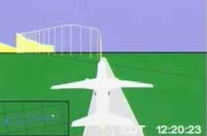
 The first thing I saw that made me scratch my head was the latitude line that intersects the runway at takeoff, as seen above. Runway 30, at the south end of Dulles airport, points slightly north of west, for a compass bearing of 290 degrees real, and about the right angle to intersect a latitude line as seen on the rendered runway. But below is a map I made that shows the nearest major latitude lines: 38 degrees, 57 minutes, zero seconds (38° 57’ 00”) North, which does not intersect even this massively long runway, and 38° 56’ 00”, which runs just south of its base. The intersector could be 38° 57’ 30”, though it seems a bit odd to map this mid-point when the minutes are so close already.
 While not conclusive in itself, this linear oddity makes sense in the context of this anonymous comment left at my blog using “we” when referring to the NTSB:
“The ground representation below NTSB animation of Flight 77 is not connected to the aircraft data that makes the plane move. The data from the FDR was used to make the aircraft animation, but there is no actual correlation to the ground. The NTSB animation is only a working copy and we never finished it to be accurate to actual ground objects.”
There was an effort to show ground objects, of course, with the rendered runway and the Pentagon overlay map relative to the pane at start and finish. With only these two points, the grid in between the two, and the plane’s movements to go on, I’m attempting to see how closely the animations global grid compares with real world lines.
 One thing about the grid map we should also see is the longitudinal separations being narrower than latitude. At the equator, the rectangles formed where lines intersect are square (the sides are “equated”). Latitude lines (east-west) remain parallel and equidistant, and are often called “parallels.” But Longitude lines (north-south) run closer together nearer the poles and in fact merge there. The net effect of this is that the parcels become narrower rectangles as we move north or south.
 The Grid at the Pentagon
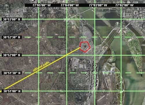
In the upper 38th parallel, the location of the Pentagon, the rectangles formed are at a proportion of about 5:7. In the map below, I also subdivided the latitude measurements showing the halfway markers at 30 seconds (30”). These are the dotted lines, and would probably not be mapped in an animation. The Pentagon lies between 38° 52’ and 38° 52’30” north, and 77°03’ and 77°04’ west, with point of impact at near dead center of that rectangle that would, by definition, be the rough area of the animation overlay map. Note that none of these lines crosses or touches the Pentagon itself.
 If the animation’s map were set to real-world lines, its proportions around the Pentagon should look something like the graphic I did at left (dotted lines included for reference). Instead what get is the situation below, a slightly enhanced screen cap with Pentagon circled in red.
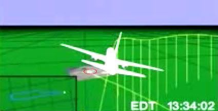
Did the Safety Board's experts shrink and shift the Pentagon here, so rather than dominating a third of the rectangle it’s a speck at its northeast corner? Looking closer at the overlay map, this latitude line actually crosses the northern third of the Pentagon, which is not what the real lines do.

These clearly are not latitude and longitude lines at the minute marks. While too big by far for that, they are far too small of course to be degree markers. Do these represent any real groupings of real-world lines (say every five minutes)? Or is this Perhaps this just some mappish looking grid meaning nothing at all just etched on to show “hey, this is some kinda globe.” Perhaps this is one of the shortcomings of the “working copy” they ironed out later in the process.
Three other questions remain under investigation: the proportions of the rectangles shown, the overall orientation of the grid lines (based on true north or magnetic?), and whether the final map is rotated relative to the program’s internal geography. These will take some more analysis, although in the last case it seems there's clearly some kind of rotation.


10 comments:
Good article. Regarding the grid lines - these should be True North for one reason - True North always points at the pole, parallel to the lines of longitude.
I'd be surprised if the grid was off, unless the animation is less sophisticated than I'd expect it to be. The FDR contains grid position from the IRS, so IMHO there is no reason for this data to be missing, inaccurate or requiring additional processing before it appears, correctly positioned and orientated, under the animated aircraft.
You almost got it CL.
You missed a little bit though.
The land image isn't just rotated, it's been moved.
Re:Dulles Runway
Is not a land image
btw, your main column width needs to be twice as wide at least. Reading your blog is pita.
You have my email.
mod: thanks, good to hear from ya.
I'm not sure how black boxes read, but I have seen some clues that it's going off the compass with no correction.
If so, I doubt the latitude lines would be corrected while longitudes remian pointing leftish ten degrees, creating a grid of trapezoids. Instead all lat lines would be rotated as well and the whole thing thrown off to the point of uselessness, depending on where the pivot point is on the globe. It's complicated.
You're probably right though and this is corrected east-west/north-south. But either way I think it's clear the gridlines are not in proper proportion to reality.
anon:
It's been moved? You mean the final overlay map? It's in proportion to the flight path and distance from origin, so I'd figured it was in the right spot, just rotated and with a useless background grid.
"Dulles Runway Is not a land image"
Not in the sense of a satelite map, but it's rendered at what seems the right spot and angle under the plane at takeoff...
I've thought of widening the column here - not too good with html. Formatting was the main problem here, which I've fixed. Pita? Ah... pain in the arse. :) I'll work on that.
I'm glad you're on of the anonymouses I know, I guess Undertow.
Or perhaps not. Hmmm...
Yes, Undertow. I click anon instead of other on the form here. Sry.
Just trying to help.
I say moved based on just what I see in your pictures.
In this one
http://i133.photobucket.com/albums/q62/chainsawmoth/FrustratingFraud/map_fullarea_lat_long.jpg
Snip out the pentagon and move it left 1, down 1 'squares'.
My thinking is the Lat/Lon is matched in the rendering between the 'world' and the plane. The land image of the target is placed at th end of data with no relation to anything else in the 'world'.
That could be UT.
"The land image of the target is placed at th end of data with no relation to anything else in the 'world'."
Except for the data itself.
My own guess is the yellow path is accurate - more or less, in the broad context, and the grid lines are what's off. And the final map rotation.
My guess now is the rectangles are square, and this is set at the equator instead of 38 north in a small oversight. That could well be wrong, but I'll be looking into it more when I have time in the next few days.
Thanks for the thoughts. I'll keep that possibility in mind too.
"Except for the data itself."
Which is why I said, 'placed at the end of data'.
The land image is the only object within the rendering which is not data related or render sourced.
The path is also not related to this topic, that goes deeper. The rotation as well while important, is a minor detail of what we're looking at here.
The grid is important as well, and I just did this. The square I made on the image ended up being is 30px by 30px. I drew it before I looked at it's size.
http://www.aa77fdr.com/misc/animation_plots_analysis_square.jpg
So there is more to learn there. It's a square. Hmm.
Sorry for the delayed response. That's a possible clue and thanks for pointing it out to me. Indeed the lower left corner master map has the flight path over about three squares. If these mark some amalgamation of the onscreen rectagles, they should have the same proportions as those parcels. That is, if a block of say 20 minutes by 20 minutes is square, a one-by-one minute unit should also be square.
Not sure what these larger squares represent, but something to look at. :)
Also, I'm emailing you on this too - I looked at what those lines could represent, and see almost six degrees crossed (by my mapping I'll post soon). In real life these squares represent, width-wise, just under 2 degrees each (?) and do you see any kind of difference with the grid line orientation or is that just me?
http://i133.photobucket.com/albums/q62/chainsawmoth/FrustratingFraud/small_screen_comp.jpg
Post a Comment